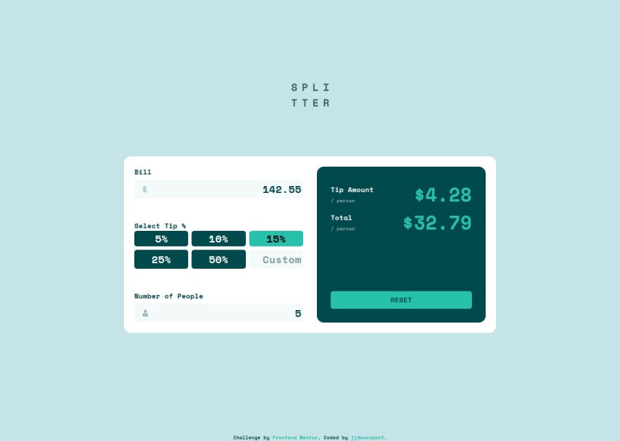
Tip Calculator App with JS, Flexbox and Grid
Design comparison
Solution retrospective
Making my JS simpler by calling functions instead of putting all the code into the button and input event listeners. I built the site mobile first and would do the same next time.
What challenges did you encounter, and how did you overcome them?The main challenge was the logic behind the JS, I rewrote my code once to make everything easier and simpler.
What specific areas of your project would you like help with?Any feedback is appreciated.
Community feedback
- @ajkun55Posted 11 months ago
Your design is not same with requirement, the default input should be void, and your page with outcomes already there; The number of people should not be zero and error message display, yours have none; When I checked the js function, it seems not woking well, the custom tip not right and position badly, but your project is mostly fine.
Marked as helpful1 - @kodan96Posted 11 months ago
hi there! 👋
You experience layout-shifting because you applied border to your
inputfield when it's focused. border widths are calculated into your layout, hence they cause shifting when they appear on different states, like:hover,:focus, etc.If you wanna prevent this, just replace borders with outlines. the syntax is the same. For example:
outline: 1px solid black;Hope this helped 🙏
Good luck and happy coding! 💪
Marked as helpful1
Please log in to post a comment
Log in with GitHubJoin our Discord community
Join thousands of Frontend Mentor community members taking the challenges, sharing resources, helping each other, and chatting about all things front-end!
Join our Discord
