Not Found
Not Found
Not Found
Not Found
Not Found
Not Found
Not Found
Not Found
Not Found
Not Found
Not Found
Not Found
Not Found
Not Found
Not Found
Not Found
Not Found
Not Found
Not Found
Not Found

Submitted

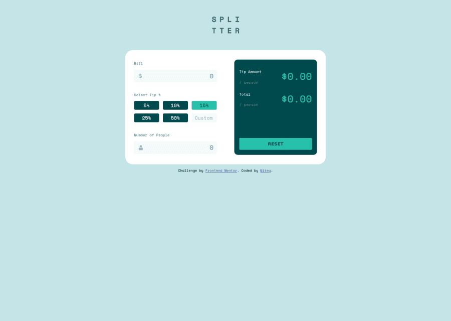
Tip calculator app with HTML, SCSS & JS

Michael 100

@mikeyxx

Desktop design screenshot for the Tip calculator app coding challenge

This is a solution for...

  • HTML
  • CSS
  • JS
2junior
View challenge

Design comparison


SolutionDesign

Solution retrospective


Working on this project was very challenging for me as this is my first time of working with JavaScript on a project. I've only previously built projects with HTML and CSS. Although I had a lot of help working on this project, I am really proud that I was able to complete it. I'm proud of how great it looks. I will be taking on more JavaScript projects to help me improve.

Please check it out and let me know what you think.

Community feedback

@pikapikamart

Posted

Hey, awesome work on this one. Layout in desktop is small, did you code this while you are zoomed in though? Making it larger would be really great. Currently it is not responsive enough since if you go at around 640px going down, content are being hidden. Mobile layout though looks good.

Some suggestions would be:

  • You don't need the h1 in the header since there is the website-logo that will give the name. For the h1, you should have used that inside the main as the first text-content element. Using like a text-content of "frontendmentor tip calculator example".
  • Website-logo img should be using the website's name as the alt like alt="splitter". Remember that a website's logo is meaningful so always make sure it uses the proper alt value.
  • Those bill and number of people should be a label for the input below them and not a heading tag.
  • The dollar-icon as well the person-icon on each input should have aria-hidden="true" to be hidden totally for screen-reader users.
  • For the all the input used in here, you should have used type="number" so that you won't have to error-checking for a value that is not a number. Use a min and attribute as well so that there will be a minimum value to be chosen upon.
  • Also if you are making the input look like it has an error, add a aria-invalid="true" on it so that it will be clear and you could use that as a styling hook like input[aria-invalid="true"]{}
  • For the button section, maybe making each :focus-visible state more visible since right now it is hard to tell what button am I in.
  • Since you used button in here, you could nest them inside a ul since those are "list" of button and it will give extra information to the user on how many button are there. The button you would need to have an aria-live element that will announce the certain button has been pressed or selected, because button alone is not informative. I haven't tackled this challenge yet so I can't provide a sample hehe.
  • The custom-input needs to have an associated label tag on it. Since there are visible-label, the label would be a screen-reader only label, meaning it would make user of like sr-only class. The text-content should describe what the input needs like the value on the placeholder or like add custom value.
  • Number of people input has no label, use the same method above as well.
  • Again when wrapping a text-content do not just use span to wrap it, use meaningful element like a p tag if it just a regular text or heading tag if it is an heading.
  • Another idea as well is to make use of aria-live as well dictating that the calculator has reset when the reset-button is toggled, just to make it more accessible.
  • Lastly, addressing the responsiveness since content are being hidden on that screen-width that I said above.

Aside from those, again great job on this one.

1

Michael 100

@mikeyxx

Posted

@pikamart As usual, thank you so much. I like how much you go into the details. I actually just felt the desktop layout was big enough for a calculator but looking at it again, I see your point. I will make all the edits you suggested.

Thank you:)

1
Michael 100

@mikeyxx

Posted

@pikamart Is it compulsory to use both alt="" and aria-hidden="true" for an image? Can't I just use only alt=""? and in place of <span>, can I use <small> instead of <p>?

0

@pikapikamart

Posted

@mikeyxx RIght now yes, because if you only use alt="" for a decorative image, VoiceOver in apple will still read the image, that is why adding aria-hidden="true" will completely hide the element for screen-reader.

When wrapping a text, always use p tag or other meaningful element. You can use span or small but inside the meaningful element.

<p>I am a p tag</p>
<p> I have a 
  <small> small </small> 
  tag
<p>
1
Michael 100

@mikeyxx

Posted

@pikamart I've made all the changes you suggested. Debugging is hell!! but I learnt a ton. Thank you. Next I will be working on the time tracking dashboard challenge hub.

1
Michael 100

@mikeyxx

Posted

Hello @pikamart, hope you are doing great. I have been working on the calculator app project and I have sort of hit a road block. I have been trying to build the toggle button that switches between the three themes but it does not seem to work and I cannot figure out what is wrong. Please can you help me look at my code when you have the time. https://github.com/mikeyxx/calculator_app

0
Michael 100

@mikeyxx

Posted

@pikamart Hello Raymart, please checkout my first JavaScript project

0

@pikapikamart

Posted

@mikeyxx sure, but maybe after lunchtime in here, going to code first this morning^^

0
Michael 100

@mikeyxx

Posted

@pikamart Alright, I will be on the lookout :)

0

Please log in to post a comment

Log in with GitHub
Discord logo

Join our Discord community

Join thousands of Frontend Mentor community members taking the challenges, sharing resources, helping each other, and chatting about all things front-end!

Join our Discord