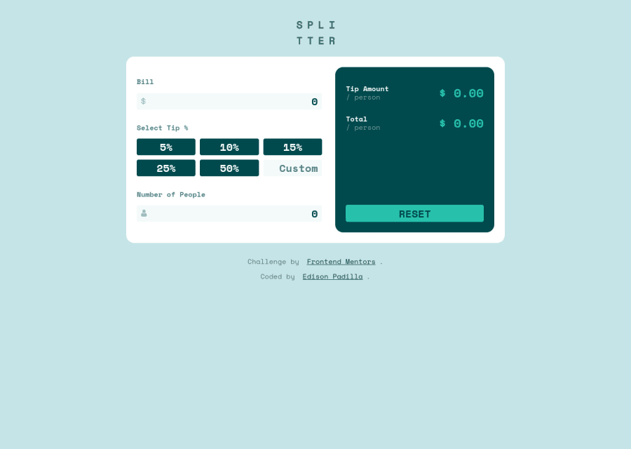
Design comparison
Community feedback
- @elaineleungPosted about 2 years ago
Hi Edy, I think you did a great job here, and everything works well for me!
In terms for feedback, I just got a few things:
-
I think you can try adding
cursor: pointeron all the buttons, as this would be better for user experience! -
In your report you got some accessibility issues; one of them is that
labelis missing for the inputs. For inputs where you don't actually have text (like the custom one), you can add a label and then add avisually-hiddenclass (need to search for the CSS here!), and for labels where the text is seen, here's what you can try:<div class="input-label"> <label for="input-people">Number of People</label> <span class="message-active-state"></span> </div> <div class="input-box"> <input type="text" id="input-people" class="input" value="0" required/> <img class="icon" src="./images/icon-person.svg" alt="" /> </div> -
I suggest having a way to store the "custom" input because right now when I click on another tip button, I lose the custom input and I'd need to type it in again. Maybe some users just want to compare the tip amounts, so having the custom value stored would help with user experience!
Marked as helpful0@EvannyPosted about 2 years ago@elaineleung thanks for the suggestions, I will apply them in this and future challenges
0 -
Please log in to post a comment
Log in with GitHubJoin our Discord community
Join thousands of Frontend Mentor community members taking the challenges, sharing resources, helping each other, and chatting about all things front-end!
Join our Discord
