Design comparison
SolutionDesign
Solution retrospective
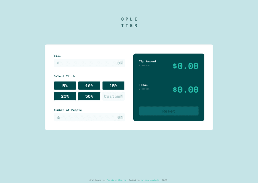
Fun challenge! Any feedback is appreciated, but I'm most interested in the javascript part. Is the code readable? Is the lack of any actual form validation a problem? How do I check for accessibility? Also, the hidden radio buttons also have they :focus state hidden, then brought back with :focus-within on the label. Is it the proper way?
Community feedback
Please log in to post a comment
Log in with GitHubJoin our Discord community
Join thousands of Frontend Mentor community members taking the challenges, sharing resources, helping each other, and chatting about all things front-end!
Join our Discord
