


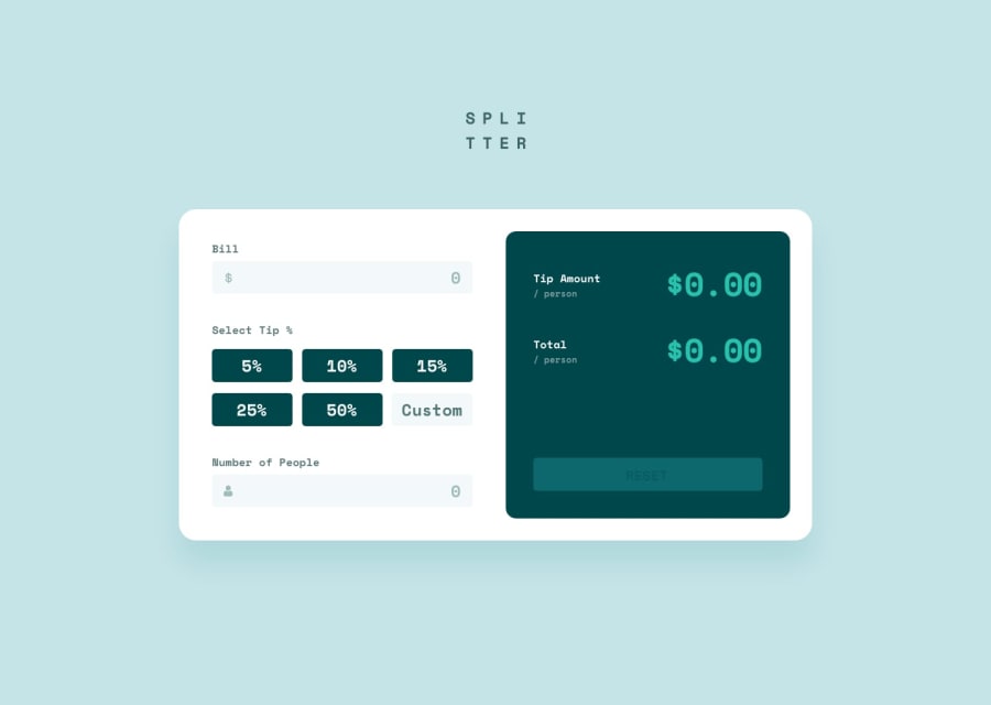
Design comparison
Solution retrospective
Hello everyone! I am pretty much a beginner still when it comes to javascript since I learned it and never really did any projects with it yet. I'd like some criticism about my JavaScript code!
Community feedback
- @GeorgeDarisPosted over 1 year ago
Hey there, Kohicha!
Your solution looks good for the most part. When it comes to your JavaScript, I would suggest you use more specific naming, such as "numPeopleInput" to differentiate variables from each other. You have two "total amount" variables, one for the DOM node and one for the numerical value of the actual amount, which could get confusing in a larger project because it isn't easy to tell them apart.
Instead of using a keydown event for the inputs you could look into using a change event, although it wouldn't make too big of a difference. Just keep it in mind for other projects where it could become useful.
When the user inputs the amount of people, a "Can't be zero message" appears even when the value is greater than zero. Can you find out why it happens? It disappears the moment another number gets added. Another thing to look out for is the fact that the total amounts display "NaN" after a reset.
Aside from what I mentioned above your JS did what it was supposed to, and you did I good job at changing the styling of the reset button with it, depending on whether all the fields had been populated or not.
There are some improvements you could make to your HTML and CSS. First of all, use semantic labels for inputs, so screen reader users can understand what inputs are for. Secondly, you could remove the set width of 11rem you have set on the percentage inputs to let them flex depending on the size of the container. Finally, you could make some changes to your media query break points to serve a mobile view a little earlier.
I hope these suggestions help you out! Continue coding and learning, and if you ever need help feel free to ask. MDN's Web Docs are also worth looking into if you haven't already.
0

Please log in to post a comment
Log in with GitHub
Join our Discord community
Join thousands of Frontend Mentor community members taking the challenges, sharing resources, helping each other, and chatting about all things front-end!
Join our Discord