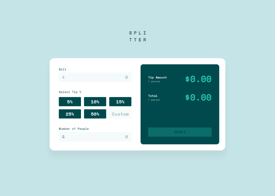
Design comparison
Solution retrospective
Hello ladies and gentlemen! Had fun with this one, using SvelteKit. Used some lovely features of Svelte like bind: for that sweet, sweet reactivity between the inputs and the amount/total results. It was also nice to use the {#if} directive to conditionally show the validation messages, and {#each} came in handy for displaying the buttons. Anyway, I hope you all like it. Feel free to leave a saucy little comment if you like!
Community feedback
- @JukiyoomiPosted about 3 years ago
Oh wow ! i'ts incredible ! What do you use to make your works that perfect ?
0@byronbyronPosted about 3 years ago@Jukiyoomi Ah thanks! 😄
To get it looking like the design as much as possible, I have the
design.jpgfile open in Preview (on mac), and I'll lay it over my browser window at the same dimensions, then I'll regularly tab between the two while styling it up. Kinda like how you would trace a drawing.Also 8+ years experience helps 😅
0@JukiyoomiPosted about 3 years ago@byronbyron 8+ years 😭 wow do you, like, measure width or height with your eyes (because you have a lot of experience) or you have a tool ?
0@byronbyronPosted about 3 years ago@Jukiyoomi 'with my eyes' 😆 that made me laugh!
No fancy tools, just Preview on mac (not sure what the Windows equivalent is). To measure the width/height of the design, I'll literally drag a box around the container and it will show me the dimensions.
0
Please log in to post a comment
Log in with GitHubJoin our Discord community
Join thousands of Frontend Mentor community members taking the challenges, sharing resources, helping each other, and chatting about all things front-end!
Join our Discord
