Design comparison
Solution retrospective
i don' t know how to set the default cursor position at the end of the text in input fields... can you guys tell me?
Community feedback
- @shashreesamuelPosted about 3 years ago
Hey good job completing this challenge
Keep up the good work
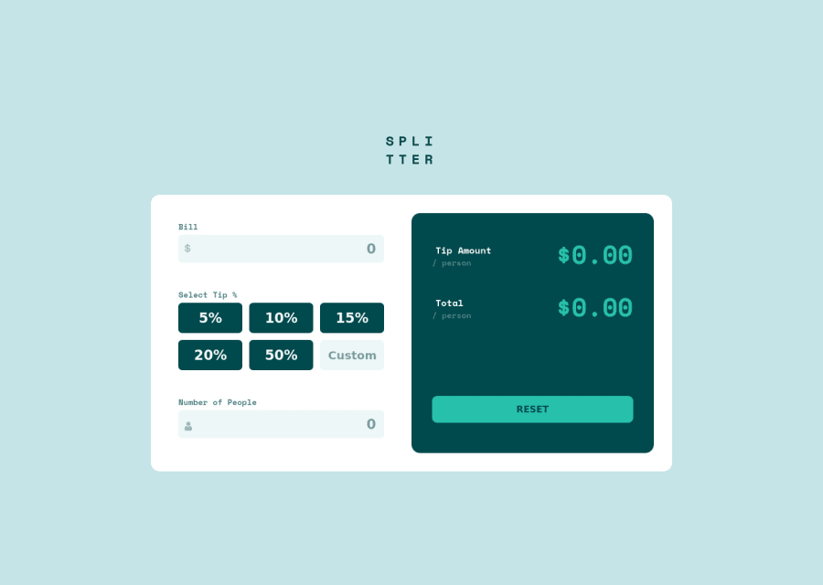
Your solution looks great however I think that the text for the reset button in the calculator needs more opacity in order to be visible
In terms of accessibility issues simply wrap all your content between main tags
I hope this helps
Cheers
Happy coding 👍
Marked as helpful0@ameer005Posted about 3 years ago@TheCoderGuru thank you for your valuable feedback 🙌 I'll definitely apply it
0 - @Jeth0214Posted about 3 years ago
Hi @ameer, your solution was nice. These are things that I noticed.
- There is an issue on accessibilities based on the report. Try to use semantic element like main element as a container for your solution. Then, instead of div use section element to group some elements.
- In your bill input, I try to input the letter "e" and "-" and it accepted it. Try to add some validation to check if the input are number characters. Or use type ="number". Overall is nice looking solution.
Marked as helpful0@ameer005Posted about 3 years ago@Jeth0214 thanks for the feedback 🙌 I'll learn more about semantic html
0
Please log in to post a comment
Log in with GitHubJoin our Discord community
Join thousands of Frontend Mentor community members taking the challenges, sharing resources, helping each other, and chatting about all things front-end!
Join our Discord

