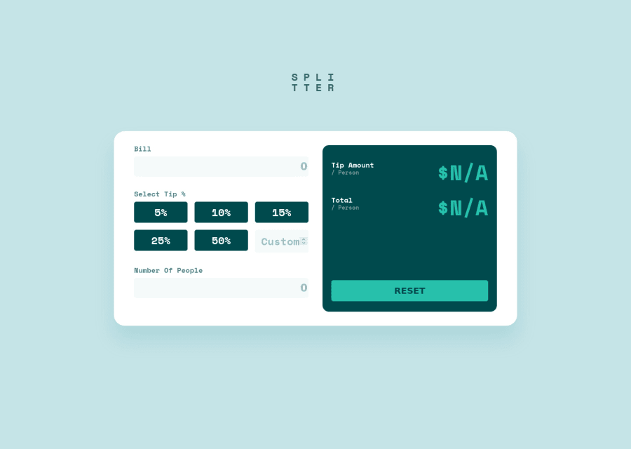
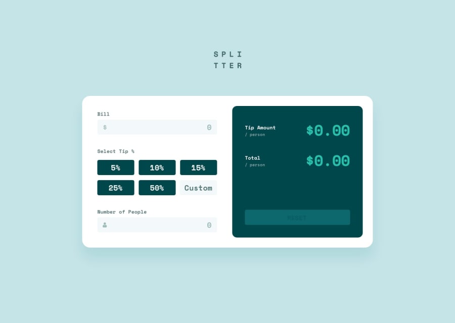
Tip Calculator App using React, Styled Components, Grid, Mobile-First


Design comparison
Solution retrospective
Hi everyone,
I used React (currently learning) to build this app. I found it quite challenging due to being new to React and not knowing how to do certain things that I know how to do in vanilla JavaScript.
A few questions that would really help me out:
-
What is the best way to show which button has been selected? I thought about storing something in the state of the "tip selection" component, but I'm not sure what I should be storing, and how I would dynamically change the colour based on which button has been stored in state (would I change the prop of the selected button somehow?)
-
Any improvements in how I have organized my React code would be great, primarily the way I am utilizing components and props (I know my styled-component and JS code looks quite messy in the calculator component).
-
I also got ESLint errors "JSX Props should not use functions", but I'm not sure how else I would achieve this functionality without sending some of the functions down to child components. Any ideas on how I could avoid this error?
-
I didn't get around to adding the error states, opting to try to conduct validation in the input fields instead. If I were to add error states, would I simply use state to check if the input is valid (turning state to either true or false), and then use a conditional in the JSX to display the error message if state says the input is invalid?
Any other comments would also be appreciated!
Community feedback
- @antaryaPosted about 3 years ago
Hello Shivam,
The app and code look neat. Excellent job 👍.
[1. One way of doing it is, as you suggested, to have a state for
selectedTipin theTipSelectioncomponent, but that should not be a number as you will have no ability to distinguish between a button tip and a custom tip. Later based on the selected tip, you can check for each button/input if it is active and style it accordingly. It would also be good to switch to custom value every time custom input is clicked/chosen.Here is a snippet with the initial code:
const tips = [5, 10, 15, 25, 50];
export default function TipSelection({ handleTipInput }) {
  // make sure you preselect tipAmount in Calculator
  const [selectedTip, setSelectedTip] = useState(`tip-${tips[0]}`);

  const handleCustomFieldChange = ({ target }) => {
    const { value } = target;
    setSelectedTip('custom');
    handleTipInput(value);
  };

  const handleTipChange = (value) => {
    setSelectedTip(`tip-${value}`);
    handleTipInput(value);
  };

  return (
    <StyledTipGrid>
      {tips.map((tip) => (
        <TipButton
          active={selectedTip === `tip-${tip}`}
          handleTipInput={handleTipChange}
          amount={tip}
        />
      ))}
      <input
        onChange={handleCustomFieldChange}
        onClick={handleCustomFieldChange}
        type="number"
        placeholder="Custom"
        className={selectedTip === 'custom' ? 'active' : null}
      />
    </StyledTipGrid>
  );
}
[2. The only idea that comes to my mind regarding the code organization is to move the input section and output sections into separate components; other than that, it looks clean. Regarding styles, it is a necessary mess.
[3. I guess it complains because on each render
handleTipInputfunction will be brand new, so you need to wrap it withuseCallbackand add dependencies; that way, on each render same function(reference) will be used.const handleTipInput = useCallback( function (tip) { const calculatedTip = tip / 100; setTipAmount(calculatedTip); }, [setTipAmount] );If you updated your code with the above change, wrapping your
TipButtonin thememowill render the component only when props change. jsx-no-bind memo
Regarding other Eslint errors; instead of writing
{
  // eslint-disable-next-line
}<label htmlFor="tip"> Select Tip %</label>
you can write it using JSX comment instead of javascript
{/* eslint-disable-next-line  */ }
<label htmlFor="people">Number Of People</label>
But better to fix using one of the ways as suggested label-has-associated-control
And for tip label, you may use aria-labelledby
[4. I guess the way you handle it depends on what is your end goal. Should it show one global message or for each input, or each input will have different errors based on different validations.
Here are some resources for more complex form validations/helpers yup and for form wrapper formik.
===
One other suggestion related to performance; There is no need for two effects that do almost the same job; why not combine into one and calculate both values there? I guess you can also combine results in one state. Otherwise, your code will be making extra render after the first run, e.g. it calls A, B(with the wrong tipAmountPerPerson) and then again B.
I hope this will be helpful.
Keep up the good work!
Marked as helpful1@shivjoshi1996Posted about 3 years ago@antarya Thank you so much for your thorough explanation! Your suggestion around the tip selection makes a lot of sense - I had the same kind of idea in my head but I wasn't sure how to implement it in the code, thank you so much for your snippet.
I'll also take a look at useCallBack & Memo, I haven't used them that much before, so that gives me some new things to learn.
For point 3 - I initially had the input elements within their corresponding label elements, which solved the error but I found it tricky to style with styled-components. I'll take another look at how I can do that!
I'll also take a look at yup & formik! & Yes, you may be right regarding the 2 useEffects, I'll see if combining them into one will result in the same functionality.
Thanks again for all your help on this! Much appreciate :)
0@antaryaPosted about 3 years ago@shivjoshi1996 Happy to help. See you on the coding trail 😉
0 - @FlashdanielPosted about 3 years ago
Hi Shivam! I love your react app it's amazing, congrats. How I track buttons clicked or selected in react is by given them a selected prop attribute with an index number and use a condition statement to check the button click then I do whatever I want to do to have that button clicked or selected. There are other better ways of doing it but this is my own solution. here is a link to my Github page where I implemented it and I hope it helps you. https://github.com/Flashdaniel/my-portfolio-reactjs/blob/main/src/components/ui/Header.js
Your code is nicely formatted but I recommend adding prettier code formatting. it helps you and other people that want to download or clone your code in the future
For Error handling you write: const [error, setError] = useState(false); Validate the input and setError (true) if there is an error. then u can write in JSX, a condition statement to display a message based on what error is. I hope this was helpful
Marked as helpful1@shivjoshi1996Posted about 3 years ago@Flashdaniel Amazing, thank you so much! I'll see if I can make those changes in my next attempt :) Thanks again for your help.
1


Please log in to post a comment
Log in with GitHub
Join our Discord community
Join thousands of Frontend Mentor community members taking the challenges, sharing resources, helping each other, and chatting about all things front-end!
Join our Discord