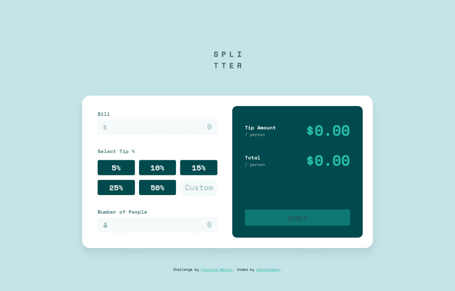
Tip Calculator App Using React JS and Sass
Design comparison
Solution retrospective
Done with this challenge ^^ Yay! Leave a comment/feedback. ty
Community feedback
- @mariusfaPosted over 3 years ago
Just for info: In a larger project you would not import all your svg files in app component. You would import them in the component where they are used.
For screenreaders/accessability reasons your input/labels are missing
for/namepairs.<label for="bill">Bill</label> <input name="bill" type="number"/>In react
for=>htmlForAlso notice the
type="number". This might remove your regex tests. This also makes phone pull up the number keyboard for the input field.Testet the site. Works like a charm and you nailed the styling :)
Marked as helpful3@darrenbawagPosted over 3 years ago@mariusfa Thanks for the suggestion :) great help
0 - @Cooly-o-CatsPosted over 3 years ago
Great Work! Few Suggestions: 1 - Reduce the white space at the top to allow it to be close to the design. 2 - In the design, there is a state and a message when input fields are blank, Could you do this?
1
Please log in to post a comment
Log in with GitHubJoin our Discord community
Join thousands of Frontend Mentor community members taking the challenges, sharing resources, helping each other, and chatting about all things front-end!
Join our Discord
