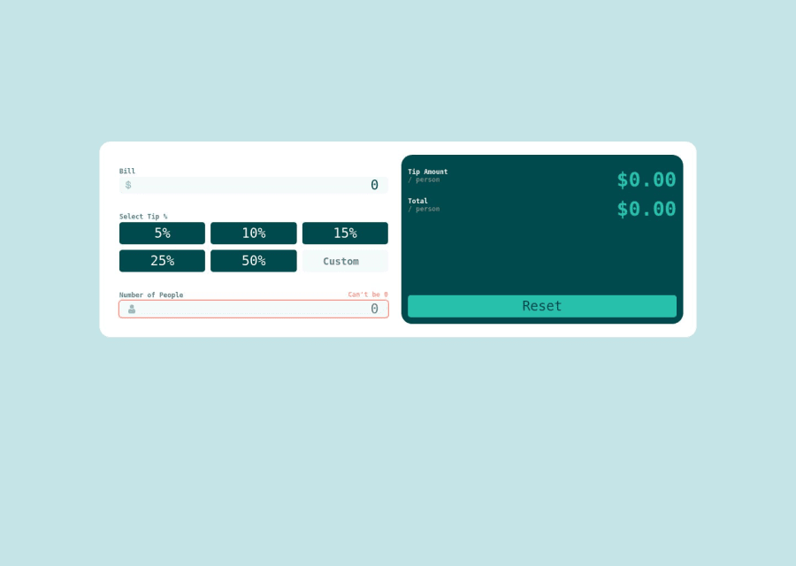
Design comparison
Solution retrospective
I have been stuck in tutorial hell for the last few months, so this is my very first attempt at creating something completely on my own. Feel free to be as brutally honest with my work.
Difficulties:
- The SVG icons in the input fields. I converted the SVG into a React component and used CSS position property to position inside the input field. This took me forever to figure out, and I'm wondering if there's an easier way to accomplish this.
- Styling the "/ person" to drop below the "Tip Amount" and "Total" lines without pushing the dollar amounts down with it. This was extraordinarily difficult for me. I ended up making each label into a flexbox, direction: column, and wrapped the dollar amount to the next column.
- Some of the React logic is probably not efficient. The reset button was specifically challenging to figure out.
Best Practices:
- React file organization. I'm sure I should organize my React components into separate folders, but I'm not sure of React component organization best practices here.
- My App component file seems very bloated. I think I've got everything working here, but I've seen some React App component files that are much leaner than mine is. I'm wondering if mine is too bloated and some of the logic should be moved to other components?
Community feedback
- @akpekigPosted over 1 year ago
Difficulties:
- Fastest, quickest, no-installation method: import your SVG as a component directly. Create React App lets you do this.
import { ReactComponent as DollarSign } from 'dollar-sign.svg'
Longer method is configuring CRA to undo a lot of its beginner limitations. At that point, you might as well just not use CRA, but also it will allow you to write code specifically telling your application how to handle SVGs, whether you want them automatically imported, treated like images, etc.
-
Personally, I would use a row flexbox/inline/inline flexbox display and instead of wrapping the dollar sign, put the "Tip Amount / person" in one element and have that wrap on itself either with a width limit or line break. Less code and definitely easier to deal with.
-
(Addressing this in second section)
Best practices:
I don't think there's any one way to program, but React is quite opinionated. I'd recommend reading this: https://legacy.reactjs.org/docs/design-principles.html . Composition + common abstraction means that when using React, you should undertake a secondary task that's not just writing code and segregating it by relevance, but also segregating it by repetition. Buttons that all have a className and clickHandler? That's one component. Containers taking similar props? That's another. Think of each component less like a specific thing (CircleWithLionInIt, CircleWithHorse, RedSquareWithFruit) that used once or twice with little modification and more like a generic thing (Circle, Shape) that gets used repeatedly with lots of modification (Circle animal=horse, Circle animal=Lion, Shape type=red).
- In terms of folder organisation, best practice is usually segregation by feature. So in the case of a button, Button.js and Button.module.css would go in the same folder, Button. Button, Input, Container, these would all go in another folder, components. In the end, you'll have something like this: src -> components -> Button, Input, Container.
Marked as helpful0
Please log in to post a comment
Log in with GitHubJoin our Discord community
Join thousands of Frontend Mentor community members taking the challenges, sharing resources, helping each other, and chatting about all things front-end!
Join our Discord