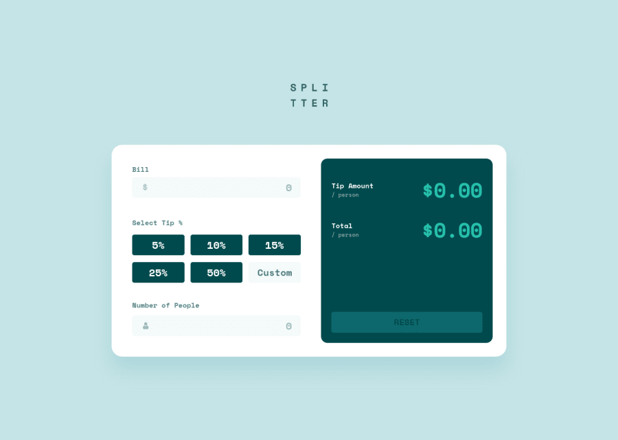
Design comparison
SolutionDesign
Solution retrospective
I found the design was not too difficult. Styling the radio buttons was a little tricky, though. The hardest part, and the part that took the most time, was catching user errors and preventing the app from breaking.
If you have any suggestions or tips on how I can improve the code, please let me know.
Thanks!
Community feedback
Please log in to post a comment
Log in with GitHubJoin our Discord community
Join thousands of Frontend Mentor community members taking the challenges, sharing resources, helping each other, and chatting about all things front-end!
Join our Discord
