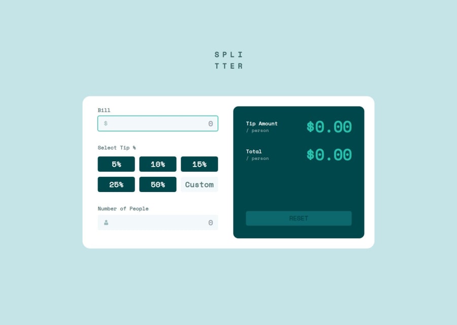
Tip Calculator App (ReactJS, NextJS, Tailwind)
Design comparison
Community feedback
- @herojk64Posted 5 months ago
I think you have Figma access you should try to match all the typography and container height and width. and even without looking at the website I can see that yellow border or outline in the input which is not in the design.
0P@vgt3j4d4Posted 5 months ago@herojk64 yeah I do have access to figma but since I’m using tailwind I tried to used preset utility classes at first. I’m uploading a new version soon. The yellow outline was added so when an input has focused it is easy to identify it (which is a good a11y practice).
0@herojk64Posted 5 months ago@vgt3j4d4 well it dosnt have to be yellow bro they have specified it and you can just use outline color while its focused it has cyan color i think yo can have light cyan when not focused and then use cyan(darker) when it is focused.
0P@vgt3j4d4Posted 5 months ago@herojk64 thanks for pointing that out. I’ll make the proper modifications.
0
Please log in to post a comment
Log in with GitHubJoin our Discord community
Join thousands of Frontend Mentor community members taking the challenges, sharing resources, helping each other, and chatting about all things front-end!
Join our Discord
