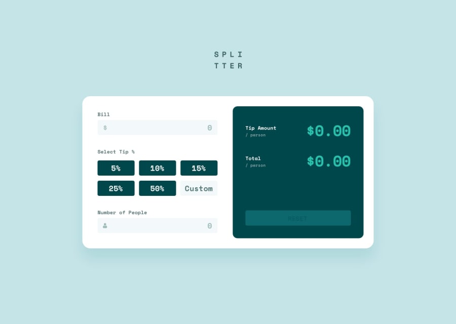
Design comparison
Solution retrospective
I am most proud of how I expanded on some of the requirements for the project, and challenged myself to add some additional functionality to improve the user experience. For example, if the user enters a custom tip that matches one of the existing button choices, the choice activates. Also, I made sure to not update the display unless both the bill and number of people have values - this is because with the absence of either value there is no tip amount per person or total per person to display. If either of the values are deleted, the display resets -- this is all done within the useEffect.
I think next time I'd try not to overthink the error handling. I got a bit stumped and had to revisit how I was treating that behavior and I think over time I recognized that the solution could be simpler than I originally created.
What challenges did you encounter, and how did you overcome them?A challenge I encountered was in deselecting one of the tip choice buttons if a user clicked the active button. (ex: user has tip 25% selected, and clicks it again) I overcame this challenge by creating a helper function handleTipClick and associating it to the radio input field's onClick attribute. This function simply determines if the user click matches the pre-existing set tip, and if so, resets the state and does some DOM manipulation to remove the hover class values. It's important to note that this function is separate from the primary handleSelectedTip function, which only runs onChange to set the new tip value. I am curious to see if maybe there could have been a way to handle all this through one function -- but the problem is the onChange attribute is required, and it doesn't fire off unless the tip value actually changes.
For some reason, on mobile devices the SPLITTER logo is hidden -- I suspect it's an error in how my tailwind code is handling the container as the screen size changes size (either the styling in the root or the main container in my App.jsx). When in development, I didn't catch this error because in the chrome browser when previewing responsive screen sizes (even at iPhone SE) the logo appears as intended. However, once I deployed my code and looked at it on my actual phone it's not in view. I'd really appreciate assistance in understanding what adjustments I could make to resolve this!
Community feedback
Please log in to post a comment
Log in with GitHubJoin our Discord community
Join thousands of Frontend Mentor community members taking the challenges, sharing resources, helping each other, and chatting about all things front-end!
Join our Discord
