Submitted over 1 year agoA solution to the Tip calculator app challenge
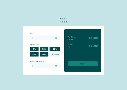
Tip calculator app | React | styled-components
@MitaliShah

Solution retrospective
What are you most proud of, and what would you do differently next time?
Implementation of the radio buttons I created for the tip selection.
What challenges did you encounter, and how did you overcome them?I struggled with the following things:
- How to keep the custom tip a
radioas well as make it a typenumberwhen the user interacts with it. I ended up making a separate element and changed that to input type number on interaction. - Displaying error messages to screen readers. I used
aria-invalidandaria-describedbyto solve that. - Styling the background color for tip selection labels when it's active: Used active state to conditionally do that.
I would appreciate any feedback! :) Thank you!
Code
Loading...
Please log in to post a comment
Log in with GitHubCommunity feedback
No feedback yet. Be the first to give feedback on Mitali Shah's solution.
Join our Discord community
Join thousands of Frontend Mentor community members taking the challenges, sharing resources, helping each other, and chatting about all things front-end!
Join our Discord