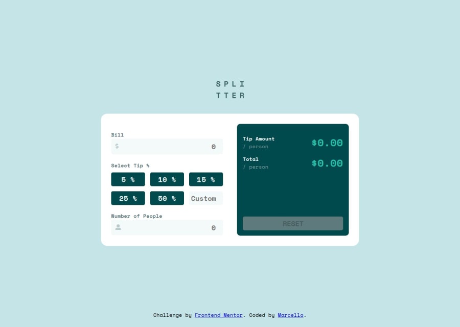


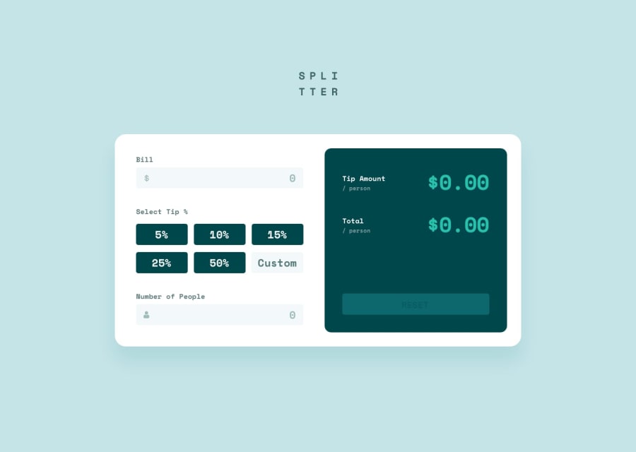
Design comparison
SolutionDesign
Community feedback
- @vgarmyPosted about 2 months ago
Hi! Your app looks great on both desktop and mobile. However, you should remove max-width: 1600px; from the body. I have a large screen, and that restriction messes up the alignment of the calculator.
Also, consider skipping type="number" in the input fields—it’s unnecessary and can be restrictive. By the way, I noticed you're using rem for sizing, which is great! It really helps with scalability and makes the design more flexible across different screen sizes.
Marked as helpful1

Please log in to post a comment
Log in with GitHubJoin our Discord community
Join thousands of Frontend Mentor community members taking the challenges, sharing resources, helping each other, and chatting about all things front-end!
Join our Discord