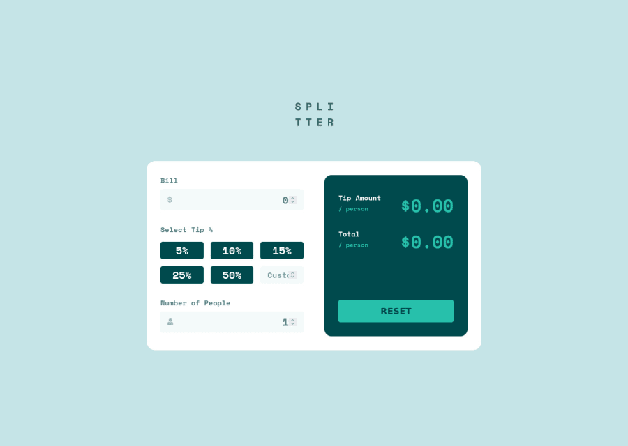
Tips calculator with Angular (Edit: Solution for restricted inputs)
Design comparison
Solution retrospective
My first Junior submission on here. This is the "Tips Calculator" developed with Angular.
Hello! For this challenge, I used Angular just to make sure I'm getting used to the basics of this framework.
Something I'm still working on in this submission is that I currently have no idea how to prevent the user from breaking the layout if the input values are greater than 5 digits. I would appreciate some ideas or suggestions.
Thanks!
( Edit: Thanks for all the feedback given, I just updated new fixes, inputs now have a maxlength attribute. I had some trouble handling numbers in text input correctly, so I got some help from the Stack Overflow community, and with a lot of learning, this is the best I could get. If you come across the same problem, just call me and I won't spare no effort to help you find a solution that fits your project perfectly. Cheers! )
Most of the HTML reports are stuff from Webpack and Babel. The next step I'll be looking forward to get rid to most of them. Any feedbacks or tips, I'm all ears!
Community feedback
- @abdullah43577Posted over 2 years ago
Hello There,
Great job taking on this challenge, regarding limiting the number of inputs, you can easily do that using an HTML attribute.
There's an HTML attribute called
"maxlength"which limits a certain value an input can render while typing.For example to limit input to just 5 numbers you could do this
<input type="text" maxlength="5">I hope you find this useful in making your code look better and stopping users from breaking your code when not following rules. 😂😂
Happy coding
Marked as helpful1@juan-galdinoPosted over 2 years agoHi, @abdullah43577! Thanks for it! I was thinking in path and you showed me an easier one, I'll definitely been doing some changes to prevent that happen again. 😂
All the best!
0 - @catherineisonlinePosted over 2 years ago
This project looks awesome, cannot wait to do it myself. I didn't check everything but if that helps, try to type a loooot of numbers and you will see how everything breaks. I would definitely fix that, especially for the mobile version.
1@juan-galdinoPosted over 2 years agoHi, @catherineisonline! You are definitely right! This was a great project to see how users can really break down their layout with simple acts. 😆 Thanks for the comment, I hope you don't go through the same with your project. If you do, I trust that you will be doing something great and I reeeally want to see it.
Cheers!
0 - @abdullah43577Posted over 2 years ago
I also have one more thing to add to make your code actually look better. I see that you've restricted users from inputting text, which is very correct. But I'll also like you to look into using placeholders as the default values in the input rather than actual numbers.
For example, you could do:
<input type="text" maxlength="5" placeholder="0"><input type="text" maxlength="5" placeholder="1">I really do hope you find this useful, Cheers.
1
Please log in to post a comment
Log in with GitHubJoin our Discord community
Join thousands of Frontend Mentor community members taking the challenges, sharing resources, helping each other, and chatting about all things front-end!
Join our Discord
