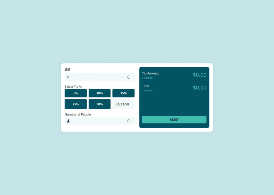
Design comparison
Solution retrospective
I’m most proud of the responsiveness and clean structure of the project. I approached the design with a mobile-first mindset, which allowed me to ensure that the user experience is optimized for all devices. The use of CSS Flexbox helped me maintain flexibility in the layout, and I successfully incorporated JavaScript logic to manage dynamic content and calculations, like percentage formulas.
Next time, I would focus on improving the accessibility of the project by adding ARIA labels and enhancing keyboard navigation. Additionally, I plan to explore CSS Grid more deeply to see how it can complement Flexbox in creating more complex layouts.
This reflects both your achievements and a plan for future growth. Let me know if you'd like any changes!
What challenges did you encounter, and how did you overcome them?One of the main challenges I encountered was ensuring the accuracy of calculations when dealing with percentages and dynamic user inputs. It was tricky to get the right formula to handle both tip calculations and total bill splits across multiple people. I resolved this by refining my understanding of JavaScript number handling, utilizing functions like parseFloat() and toFixed() to ensure the results were accurate and displayed correctly.
Another challenge was ensuring the project remained fully responsive across various screen sizes. By adopting a mobile-first approach and utilizing CSS Flexbox, I was able to overcome layout issues. Through continuous testing and adjusting breakpoints, I ensured the design worked seamlessly on different devices.
This highlights the obstacles you faced and how you tackled them, showing growth and problem-solving skills. Let me know if you'd like to add or modify anything!
What specific areas of your project would you like help with?I would appreciate feedback on the accessibility of my project. While I focused on responsiveness and clean UI design, I want to ensure the website is accessible to all users, including those using screen readers or keyboard navigation. Specifically, I’m looking for advice on implementing ARIA attributes and any improvements I could make to the overall semantic structure of the HTML.
Additionally, I’d like input on how to better optimize my JavaScript code, particularly for handling dynamic data and user inputs more efficiently. I’m also exploring CSS Grid to complement the Flexbox layout and would love any suggestions on improving my approach in areas where Grid might be more appropriate.
This gives the community a clear direction on where they can help, leading to more valuable and specific feedback. Let me know if you'd like any adjustment
Community feedback
Please log in to post a comment
Log in with GitHubJoin our Discord community
Join thousands of Frontend Mentor community members taking the challenges, sharing resources, helping each other, and chatting about all things front-end!
Join our Discord
