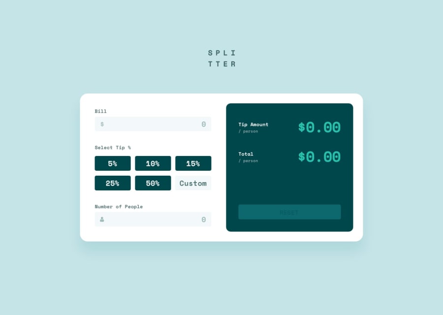
tip-calculator-app-main
Design comparison
Please log in to post a comment
Log in with GitHubCommunity feedback
- @wendyhamel
Hi there, looks like I got another of your solutions to review!
Nice work on the layout.
I noticed two differences with the design
- the text color of a selected radio tip option should be the dark cyan
- the padding of your caard is a bit wider thand the design.
Apart fron those, I think your layout looks great.
I had some trouble with reading the JS. It is a large file and some of the functions be broken up into smaller ones. And you still have some
console.log()'s hanging around from testing.Last thing, I thing the calculation is off. I think you need to show the amount of tip per person and the total each person has to pay: this should be the part of the bill per person plus the amount of tip per person.
I hope you can use my advise to improve your skills.
Happy Coding!
- P@mayor-creator
Congrats on completing this challenge. It looks like select tips are logged to the console when you select a button.
Join our Discord community
Join thousands of Frontend Mentor community members taking the challenges, sharing resources, helping each other, and chatting about all things front-end!
Join our Discord
