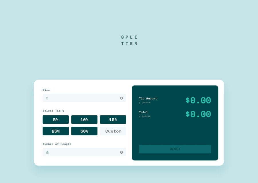
Design comparison
Solution retrospective
Hello everyone ;) this challenge was fun and helped me in my constant training in Javascript;
Obviously I ran into some difficulties along the way and wrote two versions of the code(JS), both of which worked, but the first one was longer and contained some not so necessary code, so I cut it down and hope I found a fairly coherent solution .
With this challenge I wanted to try (regarding CSS writing) the CUBE CSS formatting to create a layout that is as scalable and easy to maintain take a look if you like; )
For any questions/constructive criticism/advice I'm here and we can talk about it, see you next time ;)
Community feedback
Please log in to post a comment
Log in with GitHubJoin our Discord community
Join thousands of Frontend Mentor community members taking the challenges, sharing resources, helping each other, and chatting about all things front-end!
Join our Discord
