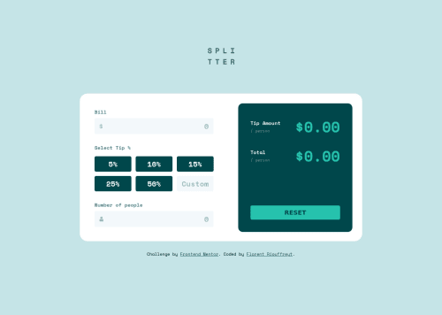
Submitted over 2 years agoA solution to the Tip calculator app challenge
Tip calculator app - HTML + CSS + JS
@FloRiouffreyt

Solution retrospective
It took a lot of time but I finally managed to make it work. But my logic is still flawed, I can't seem to be able to gather the value of the selected button without a click... So the app works perfectly fine (almost...), but the UX is not very good in the end. Maybe use checkboxes for the tip percentage values? I don't know... It would have been a lot easier with a "calculate now" button, but hey! that's the fun of it! Great exercice, anyway, really enjoyed it
Code
Loading...
Please log in to post a comment
Log in with GitHubCommunity feedback
No feedback yet. Be the first to give feedback on BigDaddyFlo's solution.
Join our Discord community
Join thousands of Frontend Mentor community members taking the challenges, sharing resources, helping each other, and chatting about all things front-end!
Join our Discord