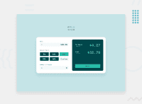
Design comparison
SolutionDesign
Solution retrospective
It was a really challenging project. I am a beginner. Your suggestions are very important to me. Thank you from now.
Community feedback
- @ChamuMutezvaPosted about 3 years ago
Use semantic html where ever possible,
- divs are not accessible through the keyboard in their current state.
- For the percentages use radio buttons (first preference) or buttons. - The reset should be a button.
- Use labels for input elements as well
Marked as helpful1@bbnos202Posted about 3 years ago@ChamuMutezva Thank you very much for your comment. I don't know much javascript. I thought this was the easiest way. I'll fix it if I can. :)
0 - @ritadoumetPosted about 3 years ago
Nice solution! There is just one small issue : the result overflows from the screen if the number is too big. Other than that, I believe your solution is great. Happy coding :)
Marked as helpful1@bbnos202Posted about 3 years ago@ritadoumet Thank you very much for your comment. I will try to fix it. :)
1
Please log in to post a comment
Log in with GitHubJoin our Discord community
Join thousands of Frontend Mentor community members taking the challenges, sharing resources, helping each other, and chatting about all things front-end!
Join our Discord

