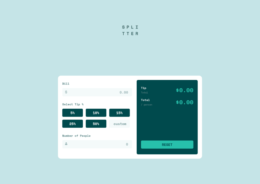
Design comparison
Solution retrospective
Honestly, I wouldn't have thought that i could build this tip calculator since my JS skill isn't that good yet. But I manage to pull this off lol π€ͺ even though it took me quite a lot of time to figure out how to make this goddamn calculator work.
Any feedback would be greatly appreciated. Thanks! βοΈ
Community feedback
- @pikapikamartPosted about 3 years ago
Hey, awesome work on this one. Layout in desktop looks really great, it is responsive and the mobile state looks really great though there is just horizontal scroll in mobile layout.
Also, it's nice that you were able to tackle and finished this one, that is really nice!
Some suggestions would be:
- Do not use
width: 100vw
since this creates a horizontal scrollbar. 100vw doesn't account the extra size of the scrollbar on the right side, that is why there is an extra scroll space. - Website-logo should be using
alt="splitter"
, the image already has the text so better start using it. - Always have an
h1
element on a page. Since there are no visible text-content that could beh1
on this, you would make theh1
screen-reader only text, search forsr-only
look it up and see how it is used. Theh1
would have that selector and theh1
would be placed as the first text-content of themain
describing what the main content is all about. - Each text like
bill
number of people
should be alabel
for theinput
that is next to them. - Each
input
icon on its left side could usearia-hidden="true"
to totally hide it. - Maybe a more visible visual-indicator on the
button
elements because tabbing on it doesn't show an visual-indicator that much. - An extra idea, since you are using
button
to make it more informative for users, you could usearia-live
attribute on an element. This element will announce that a certainbutton
is used, this way it is more accessible, you may want to look up on net on how it used though:> custom
input
needs to have an associatedlabel
to it, thelabel
would be an screen-reader only element so you would need to use likesr-only
, you can look that as well on the net.- When using heading tag, make sure that you aren't skipping a level. If you use
h4
make sure thath1, h2, h3
are all present before it, not skipping any level. - The bold-white-text on the right side, you could have used only 1 heading tag per each text and each heading tag would include the small-text below it. This way, you wouldn't use 2 heading tag for every section heading.
- Also, adding
cursor: pointer
for everybutton
on desktop layout would be really great. - An idea as well, creating an
aria-live
element that announces the form has been reset when thereset
button
is pressed.
Aside from those, really great job on this one.
2@adelinejunePosted about 3 years ago@pikamart thank you for taking you time to write this all βΊοΈ I have already fixed my mobile view so there won't be any more horizontal scroll and I'm not really familiar with a lot of concepts that you've just proposed but I will definitely do some research about it to make it more accessible especially for sr-only once again Thanks for your help, greatly appreciate it!
1 - Do not use
- @seekinfoxPosted about 3 years ago
lol i know.. but isn't this how it works? we only learn to swim when we get into water.
I'll be trying this challenge soon !, i hope i don't take decades to finish this. XD
0
Please log in to post a comment
Log in with GitHubJoin our Discord community
Join thousands of Frontend Mentor community members taking the challenges, sharing resources, helping each other, and chatting about all things front-end!
Join our Discord