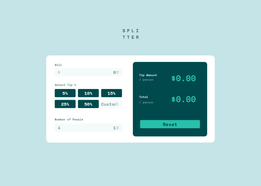
Design comparison
Solution retrospective
Hello, I have some issues on design part of mobile view , open to feedback and advice :)
Community feedback
- @DEEPAK-tech40Posted almost 2 years ago
Hiii congratulations on completeing this challenge. I have some suggestions for you.
1.First of all I would recommend working on the mobile view first it will make your life a lot easier.
2.You've used position: absolute to position the containers which gets messy while using virtual keypad in mobile I'd rather use margin or better use CSS grid to put these containers in position.
- CSS grid would've been very useful in this project.
4.You've used px to define the width of containers. There are a lot of mobile devices with different dimensions so, its better to use responsive units such as % to define width and height.
5.You've got a lot of warnings regarding the accessibility, you can avoid these issues by using semantic HTML.
Feel free to ask for any help. Thank you.
Marked as helpful1@vijayaragavanktsPosted almost 2 years ago@DEEPAK-tech40 Thanks for your valuable comment , I try to implement CSS grid in my future works, and I try to rectify the mistakes I made here, and your feedback means a lot buddy :)
0
Please log in to post a comment
Log in with GitHubJoin our Discord community
Join thousands of Frontend Mentor community members taking the challenges, sharing resources, helping each other, and chatting about all things front-end!
Join our Discord
