Tip calculator App Challenge Using HTML, CSS and Vanilla JavaScript


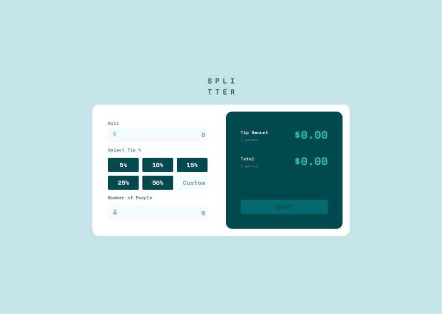
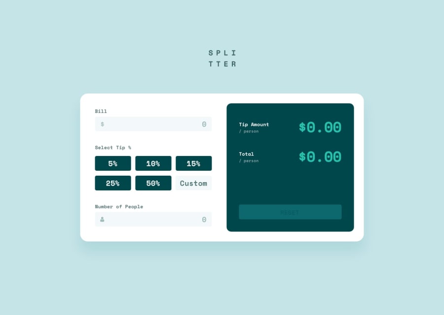
Design comparison
Solution retrospective
What I cannot figure out is why the grid container for the buttons causes the calculator's main container to shrink. If you have an explanation please let me know.
Community feedback
- @dxiDavidPosted about 2 years ago
I'm not sure why the screenshot makes it look so stretched out 🤔. The live view looks just fine.
0@PipouwPieuwPosted about 2 years ago@dxiDavid Hello 👋
This may be because there is no width defined for the <main> element.
This also causes the box width to change during the use of the calculator. For example if you enter something into the bill field and then chose a tip%, the box expands a bit which is not ideal. To fix it you could try this:
main {
    /* min-width: 100%; */
    max-width: 100%;
    width: [width from the design, I don't know what it is];
}
.calculator-container {
    width: 100%;
}
This way the component should have a fixed width but would still have a responsive behavior for screens smaller than its given width.
Hope this helps! Otherwise you did a good job here :)
Marked as helpful1

Please log in to post a comment
Log in with GitHubJoin our Discord community
Join thousands of Frontend Mentor community members taking the challenges, sharing resources, helping each other, and chatting about all things front-end!
Join our Discord