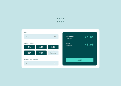
Tip Calculator App

Solution retrospective
Built with. 🔨
- HTML & CSS.
- TypeScript.
- Zod - Form validation.
- Vite.
Bugs. 🐛
- There is currently a bug where, if a user enters an invalid input (such as a negative number) as the custom tip and then selects an option from the provided tip radio buttons without correcting the invalid input, the error message does not disappear.
-
I visually hid the radio buttons, and styled the labels to look like the radio buttons. Based on the radio button’s checked or focused state, the label will be styled. I had done this before so i already had some experience with this.
-
The tricky part was the 6th radio button, which technically doesn’t look like a radio button at all but rather an input where the user can input numbers. But in reality this too should be a radio button. Because if the 6th input is selected, any current selection on the other 5 radio buttons should be unchecked and if one of those radio buttons were checked then the 6th input should be unchecked. The solution was to have a radio button and as well as an
input type="number". The radio was visually hidden. The number input is what a user who uses their mouse clicks on. The radio button is what a keyboard user will focus on. So when the mouse click happened on the number input, the radio button needed to be checked. When a keyboard moved the focus to the radio button and made it checked, the number input should receive focus so that the user can actually type into the input field.customInput.addEventListener("focus", () => { customRadioButton.checked = true }) customRadioButton.addEventListener("change", () => { customInput?.focus() }) -
You can use
formElement.reset()to reset the form inputs to their default values, including unchecking checked radio buttons or checkboxes. I used to do this manually by assigning empty strings to inputs.
Any sort of feedback is appreciated!
Please log in to post a comment
Log in with GitHubCommunity feedback
No feedback yet. Be the first to give feedback on Darkstar's solution.
Join our Discord community
Join thousands of Frontend Mentor community members taking the challenges, sharing resources, helping each other, and chatting about all things front-end!
Join our Discord