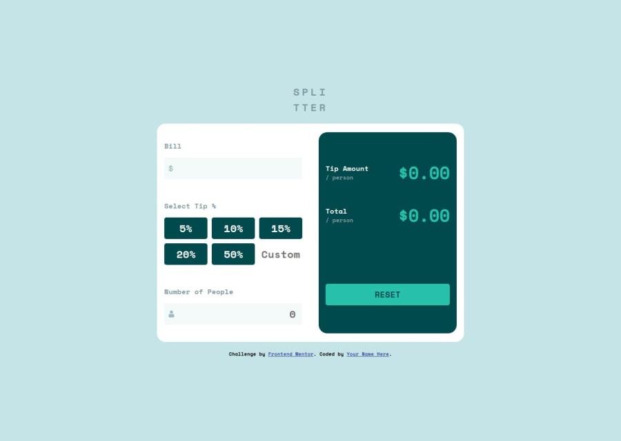
Design comparison
Solution retrospective
I thought this task will be my most challenging task and it turned out to be really interesting, I had to stay up late so I could complete it. So I am so proud that I was able to finish the task with little help and I can start to see how Javascript works. What i would next time is not to code when I am hungry. So next time I will make sure I am well fed before I start building these projects. :-)
What challenges did you encounter, and how did you overcome them?I didn't really have issues. The only one i had was resetting the values even though it was simple I couldn't do it. Maybe it was when I was doing with an empty stomach.
What specific areas of your project would you like help with?I will really need strict reviews on this project, I really want to see where I can work, so I can be better. Any opinion is welcomed.
Community feedback
- @TomSifPosted about 1 month ago
Code is good, eating is better :)
Well done for getting to the end of this project, which is more complicated than it seems !! I'm in a pretty bad position to try to give advice, given my current level, but I can try to guide you some, on few points of improvement that you could refine :
- Don't forget to add meta description and meta keywords tags for SEO
- Find out about the BEM method to name your classes in css
- It is better to use font-face to load and store your fonts, you will find most font-google in woff2 format (lighter) here: https://gwfh.mranftl.com/fonts
- I invite you to check the modern reset css: https://www.joshwcomeau.com/css/custom-css-reset/
- you can directly access the value of the percentage buttons using data-percentage='50' directly in button in html and then do a javascript loop on the buttons and directly retrieve the value of each button const percentage = parseFloat(button .dataset.percentage)
- you could have created an active class so the user knows which button he clicked and then managed in javascript to add and remove this class each time a button is clicked.
- same for your reset button, it is not animated, a small button:active with an animation would be nice for the feeling of clicking on something
- you could have limited the maximum number in your inputs to respect the design if the number is too large everything is shifted.
So I hope these little tips can help you and congratulations again for the quality of your work, keep coding, good luck :)
Marked as helpful1 - @Emynex4realPosted about 1 month ago
With this tips you gave, you are in good position to give tips
I really saw what i did and you gave me a better and simpler way of doing it Thank you so much.
1
Please log in to post a comment
Log in with GitHubJoin our Discord community
Join thousands of Frontend Mentor community members taking the challenges, sharing resources, helping each other, and chatting about all things front-end!
Join our Discord
