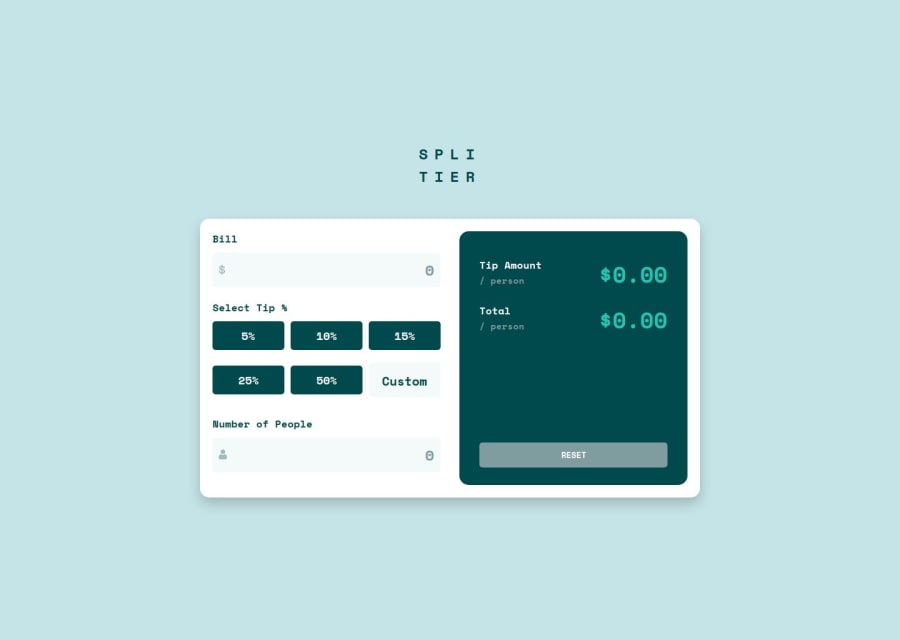
Design comparison
SolutionDesign
Community feedback
- P@elisilkPosted 6 months ago
Hi 👋 @dejuliansr,
Congrats on a great solution. 👏 I think you do a great job of utilizing Flexbox throughout the solution. Nice job.
When you are ready to dive in further 🤿, I'd suggest a few things:
- Have you thought more about implementing the error states? It looks like you included one
.error-messagefor your "Number of people" input, but it doesn't show up when a user puts in a "0". I think one issue is that in your JavaScript (lines 37 and 39), you are editing the inline style setting of the element. I'd suggest trying out thesetProperty()method instead. I'm not 100% sure if that's the issue, but I think it's worth a try. - I think it was a good choice to make 1 be the default value for the number of people. That just seems sensible. But given that choice, I wonder if it then also makes sense to put "1" as the placeholder value for that input field. What do you think?
- I also noticed that at smaller viewport widths (i.e., in the mobile design), the
bodystill has an inline padding. To be more consistent with the design, you might consider only adding that inline padding after the viewport width gets to a certain size so that the main.containertakes up the full width of the viewport. You also might consider removing theborder-radiuson the bottom of the main.containerclass too, and having it extend to the full viewport height -- all to get more consistent with the design.
Anyway, just some ideas to consider if you are thinking about improving on this solution. 🤔
Happy coding. 💻
Eli
1 - Have you thought more about implementing the error states? It looks like you included one
Please log in to post a comment
Log in with GitHubJoin our Discord community
Join thousands of Frontend Mentor community members taking the challenges, sharing resources, helping each other, and chatting about all things front-end!
Join our Discord
