Design comparison
SolutionDesign
Community feedback
- @nawfelsekrafiPosted almost 3 years ago
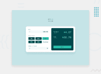
Hi @JesusMurguia , I hope you doing well 😊. Your work is almost perfect, just pay attention to the person svg in the Number of people input. also, you may hide arrows in the inputs https://www.w3schools.com/howto/howto_css_hide_arrow_number.asp also get rid of the border of reset btn. for the js it's working fine 👏😁, I'm not an expert so I can't give advices related to js but it looks fine . I hope this was Helpful. Good luck & best wishes.
Marked as helpful1
Please log in to post a comment
Log in with GitHubJoin our Discord community
Join thousands of Frontend Mentor community members taking the challenges, sharing resources, helping each other, and chatting about all things front-end!
Join our Discord

