Design comparison
SolutionDesign
Community feedback
- P@medic-codePosted 9 months ago
General feedback
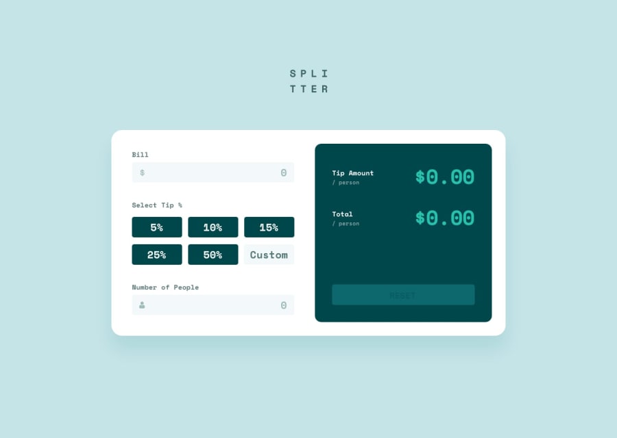
The overall experience is pretty decent, the major UX works as expected apart from the tips, it looks like you need to use the input field for numbers before it works. The HTML and CSS are pretty solid thought.
HTML
- Pretty good semantic HTML, used forms where i didn't so interesting to see!
CSS
- The icons in the input field don't have the padding - i couldn't figure how to do this but thought you should know!
- Nice use of CSS grid on the buttons, i hadn't thought about this, used flex and it was a bit more tricky.
- The applications isn't quite centered as it is in the design, probably worth adding align-items and justify-content center to the main element
JS
- For a bonus you could try adding in the functionality for the tip % otherwise no comments, pretty solid JS.
0
Please log in to post a comment
Log in with GitHubJoin our Discord community
Join thousands of Frontend Mentor community members taking the challenges, sharing resources, helping each other, and chatting about all things front-end!
Join our Discord
