


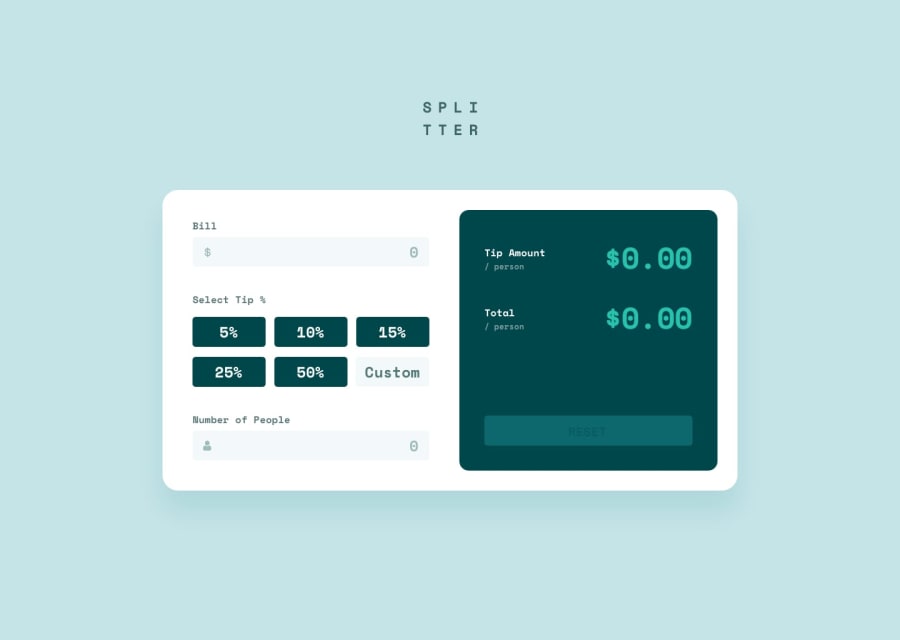
Design comparison

Solution retrospective
When designing the mobile version of the app, I ended up just using media queries to forcibly redesign the layout, and found myself switching between CSS grid and CSS flex depending on the situation. Is there a more "standard" way of handling differing layouts outside of just using media query rules?
Community feedback
Please log in to post a comment
Log in with GitHub
Join our Discord community
Join thousands of Frontend Mentor community members taking the challenges, sharing resources, helping each other, and chatting about all things front-end!
Join our Discord