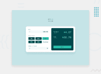
Design comparison
Solution retrospective
This is my first JUNIOR Challenge. I was away from the Javascript for a long time. So, I broke the Don't repeat yourself rule. And I also have to refactor codes. Feedbacks are warmly welcomed.
Happy Coding!
Community feedback
- @dtomicicPosted over 2 years ago
I've glanced over the code and it looks nice to me, design as well. You managed to do some stuff that I found a bit challenging in this project so great job I might steal a few ideas :P
However only "bug" I found if you can even call it that it's just like an annoying feature rather than a bug but you might look into it. When you put the amount of the bill and select the tip and if you haven't put in the amount of people you'll get an error saying that the people count cant be zero which is kind of not user friendly since the tip comes right after the bill amount many people using the calculator would first put in the bill amount then they would select the tip percentage and then at the end they would put in the people number so I would suggest letting the user set the bill amount and pick the tip percentage with just showing the textual warning above the input box that people input can't be zero, so get rid of the browser error message and calculate the amount only when people > 0 that should solve your problem.
As for the next thing I've seen is that you reload the document on reset which is fine but I found the solution of just resetting all the values to blank or 0 far better and user friendly.
Now all of the above advice is not something that is critical bugs or something like that I just like to think about the user experience since once you start developing websites for real users these kinds of things really matter, but nonetheless you did a great job considering you haven't written JS in a long time and the design looks great.
Great job keep it up :D
Marked as helpful1@hteinLinn210Posted over 2 years ago@dtomicic Thank you for your detailed feedback. I'm happy that someone use my code XD. About the feature you mentioned, it makes sense and it is good for user. I've never thought of user friendly. But I should be more careful to be user friendly from now on.
1
Please log in to post a comment
Log in with GitHubJoin our Discord community
Join thousands of Frontend Mentor community members taking the challenges, sharing resources, helping each other, and chatting about all things front-end!
Join our Discord

