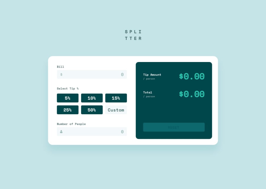
Design comparison
SolutionDesign
Community feedback
- @JanselLopezPosted almost 2 years ago
Hello 🙃, there are some improvements there that you could implement:
- Use flexbox to align the content instead of placing a large margin that does not make it responsive, here are some links to learn flexbox interactively ( flexboxfroggy, flexboxdefense)
- Instead of placing images of the dollar sign you can place a background-image to your inputs, this makes them not leave the input, you can try something like this:
background-image: url(../assets/images/icon-dollar.svg); background-repeat: no-repeat; background-size: calc(contain); background-position-y: center; background-position-x: 15px;- In addition to eliminate the "arrows" in the number type input you can put this in your input in css
"appearance: textfield;"There are some more improvements but I think that with this the page should give a good change, I hope it has been helpful 😊.
Marked as helpful0@taepal467Posted almost 2 years ago@JanselLopez Thank you so much! I deleted the img tags and used the CSS code you gave me. Works much better!
0
Please log in to post a comment
Log in with GitHubJoin our Discord community
Join thousands of Frontend Mentor community members taking the challenges, sharing resources, helping each other, and chatting about all things front-end!
Join our Discord
