


Design comparison
SolutionDesign
Solution retrospective
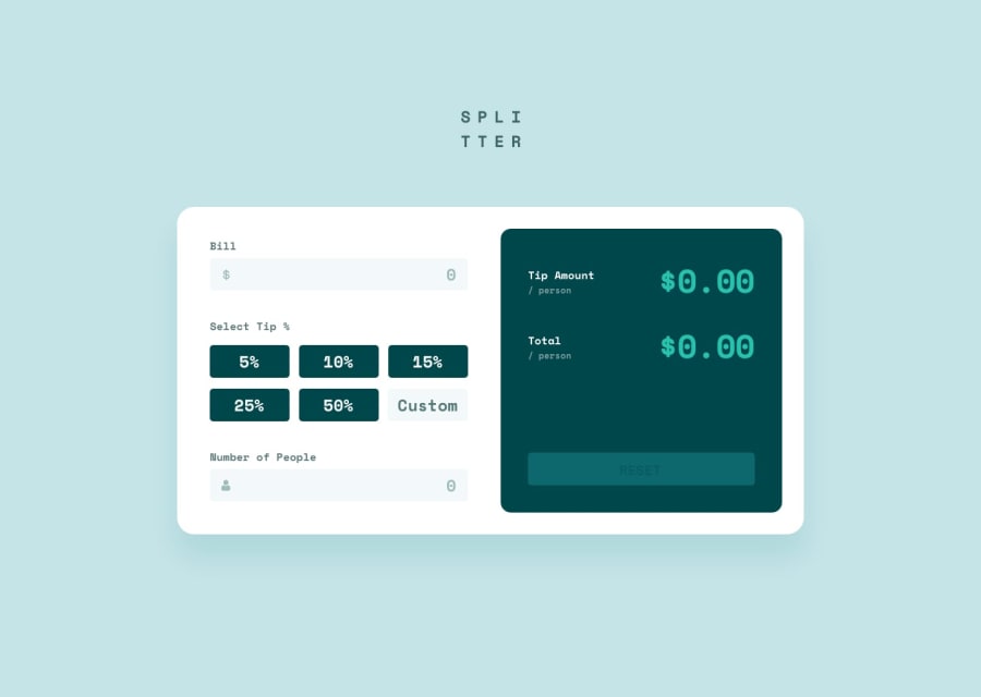
The disable button was very annoying. Anytime I change the normal button it change with it. For example, I added a background color to it and it would also change to that color, making it look the same.
There is still a few bugs I need to fix (with the error display). The grid isn't perfect. Still need to add some stuff I added in that isn't part of the project. Reason: want to try it.
Community feedback
Please log in to post a comment
Log in with GitHubJoin our Discord community
Join thousands of Frontend Mentor community members taking the challenges, sharing resources, helping each other, and chatting about all things front-end!
Join our Discord