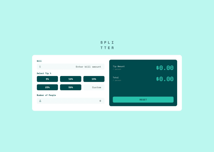
Design comparison
Solution retrospective
I'm most proud of creating a responsive, accessible Tip Calculator app that provides a smooth user experience across devices. The use of semantic HTML and ARIA roles ensures that the app is accessible to a broader audience. If I were to do it differently next time, I would explore using a JavaScript framework like React to make the app more scalable and modular.
What challenges did you encounter, and how did you overcome them?One challenge was managing the layout transitions between mobile and desktop views while maintaining accessibility standards. Ensuring the layout was both visually appealing and functional required tweaking the CSS and using media queries. I overcame this by following a mobile-first design approach and utilizing CSS Grid and Flexbox effectively to adapt to different screen sizes.
Community feedback
- @ShivamRajput57Posted 6 months ago
i think you box have high width as compared to the height of the box
0
Please log in to post a comment
Log in with GitHubJoin our Discord community
Join thousands of Frontend Mentor community members taking the challenges, sharing resources, helping each other, and chatting about all things front-end!
Join our Discord
