Design comparison
Community feedback
- @AdrianoEscarabotePosted 5 months ago
Hello AlexCristea2007, how are you? I was really pleased with your project, but I’d like to offer some advice that might help:
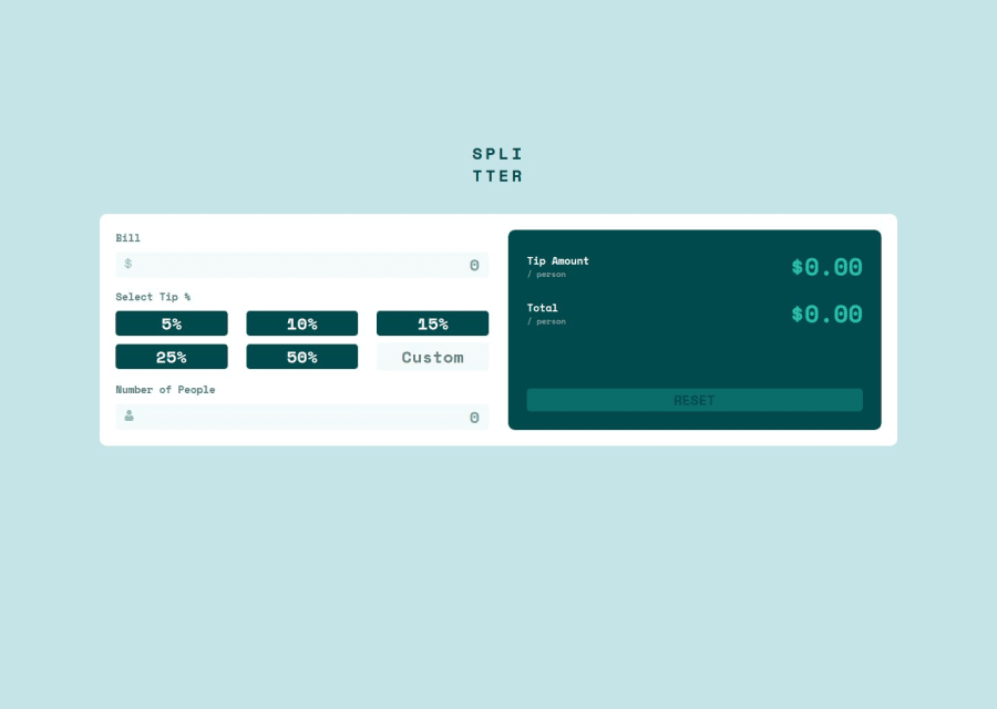
I noticed that your component is growing a lot at higher resolutions, to resolve this we can do the following:
.calculator {
    width: 100%;
    padding: 2%;
    display: grid;
    grid-template-columns: 1fr 1fr;
    gap: 2.5%;
    background-color: var(--white);
    border-radius: 10px;
    max-width: 820px;
}
Instead of using "width" to specify an absolute width, use "max-width" to specify a maximum instead. By doing this, the content will behave much more amiably in smaller resolutions, making it easier to make the project responsive.
The rest is spot on.
Hope it’s helpful to you. 👍
Marked as helpful1@AlexCristea2007Posted 5 months agoHey @AdrianoEscarabote, thank you very much for this small adjustment I missed. Even though the interior design is displayed accordingly inside the main wrapper, you're right here saying that it stretches way to much on wider screens.
1
Please log in to post a comment
Log in with GitHubJoin our Discord community
Join thousands of Frontend Mentor community members taking the challenges, sharing resources, helping each other, and chatting about all things front-end!
Join our Discord
