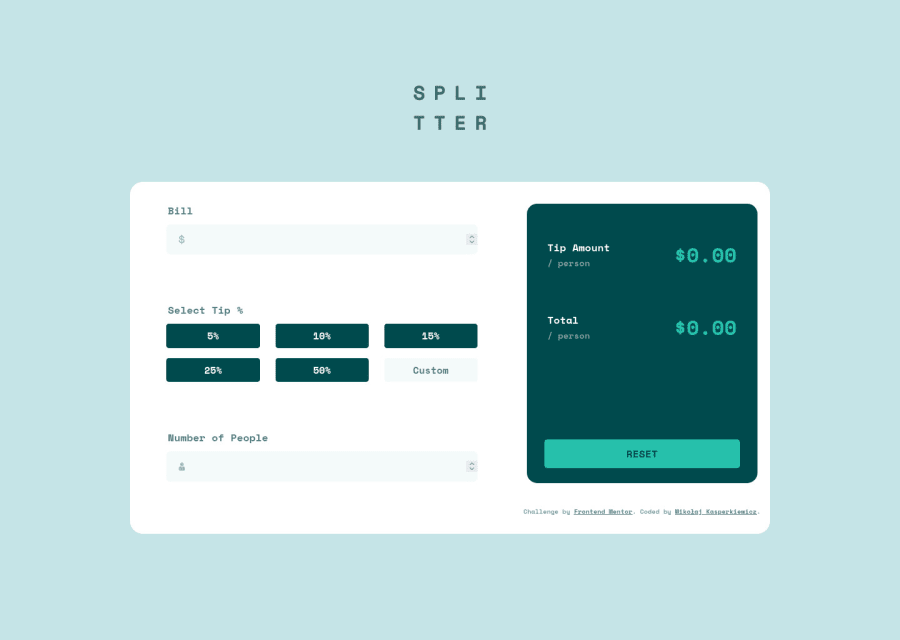
Design comparison
SolutionDesign
Solution retrospective
Let me know what you think about this attempt
Community feedback
- @shashreesamuelPosted over 2 years ago
Hey PanMikolaj, good job with this challenge. Keep up the good work.
In terms of your solution I think the boxes for each currency should be a bit smaller in width, the card that gives the output can be a bit wider and the fields can be a bit smaller
In terms of your accessibility issues
-
Form elements must have labels
-
Wrap all your content within a
<main>tag to fix the other accessibility issues.
In terms of validation errors, the
<input>tag must be a descendant of a<button>I hope this helps
Cheers Happy coding 👍
1 -
Please log in to post a comment
Log in with GitHubJoin our Discord community
Join thousands of Frontend Mentor community members taking the challenges, sharing resources, helping each other, and chatting about all things front-end!
Join our Discord
