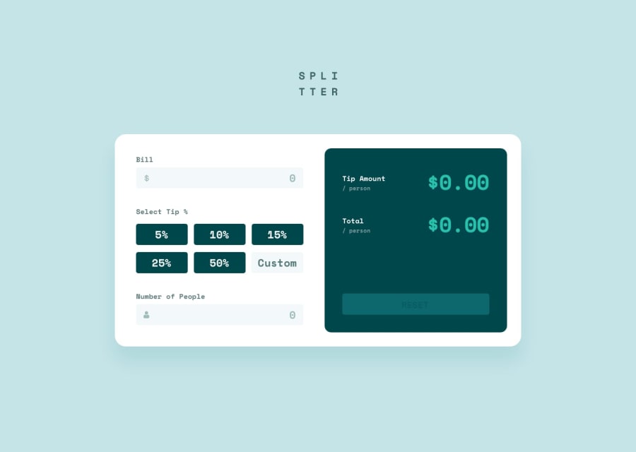
Design comparison
Community feedback
- @BeinRain06Posted about 1 year ago
Yeah @Ibukun450 amazing your application operates well.
You need just only to improve the responsiveness
Don't try to make it hard one thing I noticed is that you began styling your page within index.html* and end it into style
I feel like a most efficient way to tackle responsiveness is to group all style in one place.
Then you can also make the container respond accurately to change you apply.
Try moving this section of code in your style.css:
body {
    background-color: #c4e5e8;
    **width:100vw;**
    display: flex;
    justify-content: center;
    align-items: center;
    flex-direction: column;
    min-height: 100vh;
    font-family: 'Space Mono', monospace;
}

.main-container {
    width: 50%;
    padding: 20px;
    height: auto;;
    background-color: #fff;
    border-radius: 15px;
    padding: 30px;
}
Adding width :100vw ; to the body
you can also design at least 2 stage of responsiveness for your application using
@media and screen (min-width:180px) {
...
}
And
@media and screen (min-width:760px) {
...
}
For mobile and tablet or desktop
And change your main-container to have a width of 100% when styling mobile form play with some padding, margin, flex-direction and that it's pretty it.
You will wondering your new design, at least it could be a shift better.
You have the right to do this. And feel more happy about your project.
Well with that says I hope you a nice night /day @Ibukun450. glad to meet you in the front of line, and will to continue to see you on a next time.
0
Please log in to post a comment
Log in with GitHubJoin our Discord community
Join thousands of Frontend Mentor community members taking the challenges, sharing resources, helping each other, and chatting about all things front-end!
Join our Discord
