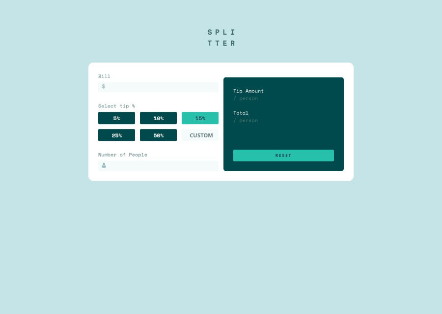
Design comparison
Solution retrospective
I managed to complete the task.
What challenges did you encounter, and how did you overcome them?The buttons to select the tip required a little more of thought to fully function within the tip calculator.
What specific areas of your project would you like help with?I dont't know how well I managed the buttons for selecting the tip and the total working of the tip calculator. Any suggestions are really appreacited :) Thank you
Community feedback
- @MaelkMarkPosted 3 months ago
Nice solution, good job!
For the tip amount buttons you can use input type radios instead of checkboxes, because then you don't have to uncheck them manually from js. Just replace checkboxes with
<input type="radio" name="tip" value="5">. You must give them an identicalnamefor the automatic unchecking to work. You can also give them a value (eg. the amount) and then you can get the tip amount with this line of code in js:document.querySelector(".button > input[type='radio']:checked").value. This line will return the givenvalueof the checked radio button.Hope this helps (and please upvote)
Marked as helpful1@ArcloanPosted 3 months ago@MaelkMark I just looked at your solution for the multi-step form. You have done all that with only css :-O!!! You are really awesome. Can you link some resource where you learned all to do all that? I struggle a little with css, I have used much more time to learn it barella enough with respect to js. There are plenty of thing that I don’t know of js yet but for me is much more intuitive learning js. If you can link some useful resource and can tell me how much time you are writing css it would help me. Thank you very very much!
0 - @TedJenklerPosted 3 months ago
Hi @Arcloan,
Nice project! Here are a few suggestions for improvement:
Input Validation: Currently, your inputs aren't validated. To ensure users can only input numbers, you can use an if statement to check if the value is a number. For example:
if (!isNaN(Number(inputValue))) { // Proceed with showing value } else { // Invalid either let it block not a number/NaN or error message } This will prevent non-numeric characters from being entered and enhance the user experience.
Keyboard Accessibility: For an extra challenge, you could make your calculator usable without the mouse. This can be achieved using DOM manipulation and handling keydown events. This will improve accessibility and provide a better user experience for those who rely on keyboards.
Accessibility Improvements: Adding ARIA labels can significantly enhance accessibility for screen readers. Consider adding ARIA labels to your inputs and buttons. For example:
<input type="text" aria-label="Enter number" /> <button aria-label="Calculate result">Calculate</button>This will help screen readers convey useful information to users.
Hope these suggestions help!
Best, Teodor
1
Please log in to post a comment
Log in with GitHubJoin our Discord community
Join thousands of Frontend Mentor community members taking the challenges, sharing resources, helping each other, and chatting about all things front-end!
Join our Discord
