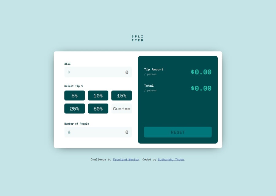
Design comparison
SolutionDesign
Community feedback
- @hannerrPosted 7 months ago
Hi, Nice job! Some small things you might want to add:
- the company logo is a bit small compared to the design
- on mobile there is no margin above the logo
- on mobile the lower corners of the white box are not rounded
- until all inputs are filled the result shows NAN - maybe 0.00 would be better?
- I think the font in the buttons should be bold all the time, not on hover
- i know writing readmes is annoying but it helps finding your way around a repo, if your memories are not fresh sometimes
- nice js, but maybe you want to try to keep the calculate function smaller by making an extra function for the eventlisteners. this could get quite messy when it grows... I hope I helped a bit! cheers hanna
0
Please log in to post a comment
Log in with GitHubJoin our Discord community
Join thousands of Frontend Mentor community members taking the challenges, sharing resources, helping each other, and chatting about all things front-end!
Join our Discord
