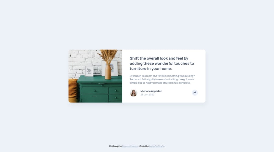
Design comparison
Solution retrospective
Hey, everybody!
This is my first challenge with JS, and it was fun! π
The JS was easy, but the CSS took me a little longer to code than I initially thought. π
Feedback on both the design and code is welcomed and appreciated! π
And as always, happy coding! π
Community feedback
- @correlucasPosted over 2 years ago
This comment was deleted over 2 years ago
0@ApplePieGiraffePosted over 2 years ago@correlucas
Hey! I haven't actually tried to make this challenge without JS, but it might be possible given that you can use the "checkbox hack" to create the popup menu for the card component (which I see is what you did in your solution to this challenge) and that you can style the desktop popup menu to look different in the mobile view (which is what I did in my solution to this challenge). Check out lines 155-187 in these styles. You'll have to use a media query to adjust the size and position of the popup menu and the items inside it. π
Even though creating these challenges without JS is fun, nowadays I do not recommend it so much because it is often simpler to use a little bit of JS to accomplish the same thing and often times it is much more accessible. Have fun, though! π
1 - @adityas24Posted over 3 years ago
Hey in your design i saw that the size the of the card remains the same, i mean that it looks like that you had set some fixed width and height. And also it shifts to mobile design quite early at around 1000px. I want to ask that is it OK to do it like that. I am a newbie here. I am trying to make it responsive for every possible point and shift to mobile design atleast after 500px . But its a mess for me that way. Please help me out.
1@ApplePieGiraffePosted over 3 years ago@aadigit
Hi, aadigit! π
It's fine to set a fixed width and/or height for certain elements in your siteβI usually like to allow elements to be sized by their content so that there isn't too little or too much space. But don't worry too much! For this challenge, you could set a fixed width for the card component and simply change it with a media query when the width of the screen becomes small (you can allow the height of the card to be determined by its content, though).
When I was beginning web development, I tried to make things responsive by setting lots of dimensions in percentages, but that doesn't work out so well for me all of the time because then it's hard to predict how things will look at certain screen sizes and things sometimes become a little messy.
I think setting fixed dimensions for elements is okay as long as you take into account how they will look or affect the layout of the site when the screen is small/medium/large. Sometimes, percentages will work better. It depends on the element and the context and the elements around it. But with practice, you'll be able to choose which elements of your page should have a fixed width/height and which ones should have a variable width/height based on something else like their parent container or the viewport.
Hope that helps. π
0 - @DarknessflowersPosted about 4 years ago
Amazing job at getting this pixel perfect to the design! It looks so slick.
1@ApplePieGiraffePosted about 4 years ago@Darknessflowers
Thank you very much!
0 - @LaBoiteDeCartonPosted about 4 years ago
Like tarasis said, you nailed it. I think the only thing missing, is the btn design when you click on it. For me the background color should change and stay fixed even when unhovered, and the same for svg color. I learned a lot from your CSS. (and felt stupid when saw your js, so clean)
1@ApplePieGiraffePosted about 4 years ago@LaBoiteDeCarton
Thanks for the feedback and the tip! I'll certainly look into that!
0 - @tarasisPosted about 4 years ago
π ApplePieGiraffe
You absolutely nailed the design. Especially that pesky image!
Visually the only quibble is the mobile design on a iPad screen using Compact Width (canβt remember the dimensions ottomh). The share button is right up on the Pinterest icon.
Need to learn from your CSS. Curious about the setting
font-size
in html to 50%, why that than an explicit figure?1@ApplePieGiraffePosted about 4 years ago@tarasis
Thanks for the feedback! π
I've heard that setting the
font-size
to a percentage rather than an explicit value gives the user a little more control over how the page appears. This is because although the defaultfont-size
for most browsers is16px
, sometimes, users set their own default font-sizes. Setting thefont-size
to a percentage means that the design will scale to thefont-size
the user chooses.I haven't actually really tested it out or anything, but I just do it as a good practice, I guess. π
0 - @CSummPosted about 4 years ago
Looks great!
1
Please log in to post a comment
Log in with GitHubJoin our Discord community
Join thousands of Frontend Mentor community members taking the challenges, sharing resources, helping each other, and chatting about all things front-end!
Join our Discord