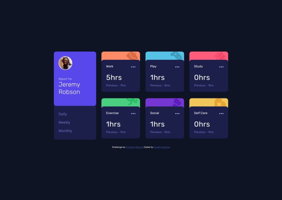
Design comparison
SolutionDesign
Solution retrospective
What are you most proud of, and what would you do differently next time?
I'm proud of completing this challenge!
What challenges did you encounter, and how did you overcome them?I struggled with displaying elements dynamically with javaScript without affecting my css layout.
What specific areas of your project would you like help with?Anything that can help me improve.
Community feedback
- P@Smailen5Posted 12 months ago
Great, excellent solution 😊, everything looks perfect both on mobile and desktop. My only suggestion, if you want to match the requested design completely, you could increase the height and width of the
containera bit.0
Please log in to post a comment
Log in with GitHubJoin our Discord community
Join thousands of Frontend Mentor community members taking the challenges, sharing resources, helping each other, and chatting about all things front-end!
Join our Discord
