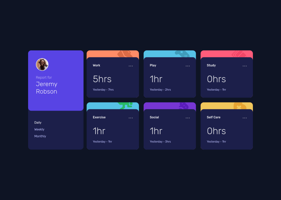
Time_Tracking_dashboad responsive site using flex, grid, js
Design comparison
Solution retrospective
I am happy this challenge.. If you would be so kind to take sometime and go over my website design/code and share any suggestions that can contribute to my growth as a developer I would highly appreciate it.
Community feedback
- @pperdanaPosted almost 2 years ago
Hi, Well done on completing the challenge! 👍
- I have other recommendation for your code to center an element both horizontally and vertically.
Using relative position
Since you use flexbox to center element both horizontally and vertically, you can also use relative position to do it.
Set the position property of the child element to "absolute" and use the "top", "bottom", "left", and "right" properties to center the element both horizontally and vertically. For example:
.parent {
  position: relative;
}

.child {
  position: absolute;
  top: 50%;
  left: 50%;
  transform: translate(-50%, -50%);
  /* other styles for the child element */
}
I hope this information was beneficial for you! 😊
Happy coding🤖
Marked as helpful1 - @0xabdulkhaliqPosted almost 2 years ago
Hello there 👋. Congratulations on successfully completing the challenge! 🎉
- I have other recommendations regarding your code that I believe will be of great interest to you.
HTML 🏷️:
- This solution may cause accessibility errors due to lack of semantic markup, which causes lacking of landmark for a webpage and allows accessibility issues to screen readers, due to accessibility errors our website may not reach its intended audience, face legal consequences, and have poor search engine rankings, highlighting the importance of ensuring accessibility and avoiding errors.
- What is meant by landmark ?, They used to define major sections of your page instead of relying on generic elements like
<div>or<span>. They are use to provide a more precise detail of the structure of our webpage to the browser or screen readers
- For example:
- The
<main>element should include all content directly related to the page's main idea, so there should only be one per page - The
<footer>typically contains information about the author of the section, copyright data or links to related documents.
- The
- So resolve the issue by replacing the
<div class="container">element with the proper semantic element<main>in yourindex.htmlfile to improve accessibility and organization of your page
COMPONENT MEASUREMENTS 📐:
- The
width: 100%property forbodyis not necessary. because it's a block level element which will take the full width of the page by default.
- So feel free to remove
width: 100%style rule frombodythis will help you to write efficient code and makes your code more reusable.
.
I hope you find this helpful 😄 Above all, the solution you submitted is great !
Happy coding!
Marked as helpful1
Please log in to post a comment
Log in with GitHubJoin our Discord community
Join thousands of Frontend Mentor community members taking the challenges, sharing resources, helping each other, and chatting about all things front-end!
Join our Discord
