Design comparison
Solution retrospective
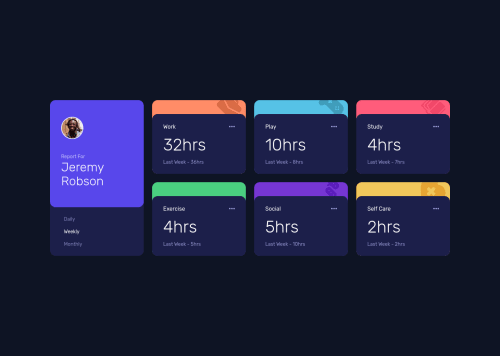
I tried my best to make px to px with image, suggestions are welcomed
Community feedback
- @shashreesamuelPosted over 2 years ago
Hey hamzaabde, good job completing this challenge. Keep up the good work
Your solution looks great I can't seem to find anything that should be changed.
In terms of your accessibility issues
-
images must have alternative text, sinpky specify the
alt
attribute and give a description of your image. -
Wrap all your content between
<main>
tags to get rid of accessibility issues.
In terms of validation errors they will be resolved when your accessibility errors are fixed.
I hope this helps
Cheers Happy coding š
Marked as helpful0 -
- @JordanMooreePosted over 2 years ago
This project looks good. Great work!
A few suggestions when visiting your site:
- The boxes with "Work, "Play", "Study", etc. should have a
cursor: pointer;
CSS applied to them (for the desktop version, of course!). - Your images must have
alt=""
in them. You don't have to put text in them but it is best if you do if anything were to ever happen to your images.
Other than that, great work. It's organized even with the number of divs there are in the HTML. Keep it up!
Marked as helpful0 - The boxes with "Work, "Play", "Study", etc. should have a
Please log in to post a comment
Log in with GitHubJoin our Discord community
Join thousands of Frontend Mentor community members taking the challenges, sharing resources, helping each other, and chatting about all things front-end!
Join our Discord