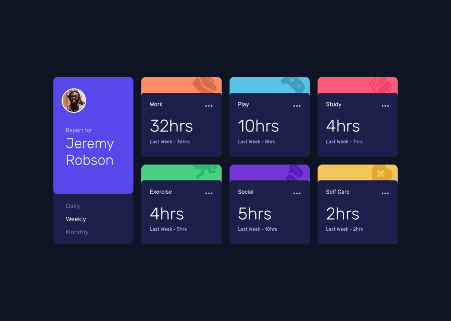
Time tracking with flex and grid. Loading JSON data.
Design comparison
Solution retrospective
My first project on junior difficulty, any input appreciated ;)
Community feedback
- @pikapikamartPosted almost 3 years ago
Hey, really nice work on this one. The desktop layout looks really great and the mobile state as well. The functionality works as well, one thing though about the layout, if you go to like 610px upwards, you will see that the contents are almost being hidden by the screen since the mobile state haven't applied yet. Adjusting the breakpoint will be really nice.
For some other suggestions, here are some:
- It would be great to have a base styling of this:
html { box-sizing: border-box; font-size: 100%; } body { margin: 0; } *, *::before, *::after { box-sizing: inherit }
This way, handling an element specially its size will be easier because of the
box-sizing
- Avoid using
height: 100vh
on a large container like themain
as this makes the element's height capped based on the viewport/screen's height. Instead usemin-height: 100vh
so that the element will expand if it needs to. - Person's image should be using the person's name as the
alt
value likealt="Jeremy Robson"
. Components like this where a person's information is presented, make sure to use their name as the person'simg
alt
value. - Also, when using
img
tag, do not forget to add thealt
attribute, whether the value is empty or not. Because by not including it, screen-reader will instead read the source path of the image which you don't want. So always include it. - For this one, since an
h1
tag is needed for a webpage, you can useh1
for the person's name for now. But since anh1
should be the first text on a landmark or in themain
, thediv
that nest thereport for
and the person's name should be using:
display: flex; flex-direction: column-reverse;
The markup would be reversed on what you are using right now:
<div class="name"> <h1></h1> <p></p> </div>
- Those selection of
button
, you could useul
to wrap those since they are "list" of selections. Also, it would be really nice for you to implement something likearia-live
that will announce what selection has been selected sincebutton
alone is not informative when it is toggled. Another approach would be to usea
tag rather thanbutton
. - Check for other
img
tag usage in this one, thealt
are missing on each. - Each card title like
work, play, etc
could be using a heading tag since they give information on what the section would contain. Usingh2
for each would be really nice. - Since you are using
button
on each of the 3 dots and making them interactive, in general and for a good practice, add anaria-expanded="false"
as default attribute and add as well either aaria-label
orsr-only
span inside it. The text value will describe on what thebutton
will do. - Lastly, just addressing the layout issue about the 610px upwards:>
Aside from those, great job again on this one.
Marked as helpful2@GlaDdosPosted almost 3 years ago@pikapikamart Thank you so much for taking your time and writing this amazing comment. I really appreciate it.
1
Please log in to post a comment
Log in with GitHubJoin our Discord community
Join thousands of Frontend Mentor community members taking the challenges, sharing resources, helping each other, and chatting about all things front-end!
Join our Discord