Design comparison
Solution retrospective
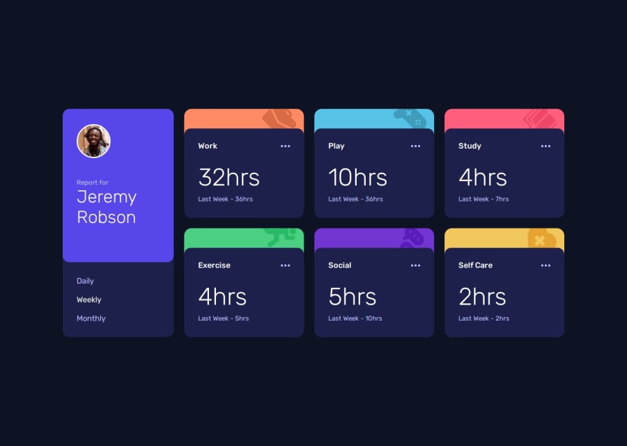
With this project, I wanted to start getting a better feeling of how I would write my CSS so I focused on submiting the solution without using the JSON file and interactivity. I am happy for having the responsiveness working 'ok'.
What challenges did you encounter, and how did you overcome them?When I looked at the design I thought it would be easier to use grid than to use flexbox at this project, but as I want to learn and master flexbox I challenged myself to use it... I had to think for a while to make de multiple column design to work (it's not perfect, but it works for now)
What specific areas of your project would you like help with?If possible, I would like some advice on how I should improve the layout responsiveness using flexbox and with the json usage.
Community feedback
Please log in to post a comment
Log in with GitHubJoin our Discord community
Join thousands of Frontend Mentor community members taking the challenges, sharing resources, helping each other, and chatting about all things front-end!
Join our Discord
