Design comparison
Community feedback
- @SatellitePeacePosted over 2 years ago
hello @01Chloe nice job i particularly like the tweaks you made to the project
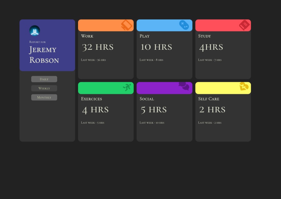
On screens > 960px the card looks ok, but on larger screen the contents of the cards are overflowing
-
So here is my suggestions instead of using grid throughout, you can use a combination of grid and flexbox
-
in your main container you can have two sections one for the cards and one for the user.
Display the main container to flex and give the user section a flex-basis of 23%
- Then you can place all your cards in the second section and use the grid to create columns
EXAMPLE
main { max-width: 1200px; width: 100%; display: flex; column-gap: 2rem; align-items: center; justify-content: center; margin-bottom: 1rem; } sectionOne{ max-width: 20rem; width: 100%; flex-basis: 23%; } sectionTwo{ display: grid; grid-template-columns: repeat(3, 1fr); gap: 1.5rem; place-items: center; } //the above is for desktop first if you want a mobile-first do sectionTwo{ display: grid; grid-template-columns1fr; gap: 1.5rem; place-items: center; } - this means you don't need a grid-template-row-
Also avoid giving heights to your card container just give them padding and allow the content to determine the height, this will help prevent overflow
-
Finally, instead of using JS to change the background color of the active button you can use the CSS focus() pseudo class so
button:focus{
   background-color: #444;
}

Then you can then use the active class only for the first button because it has to be on focus when the page loads

so

````
btnWeek.addEventListener('click', () => {
   boxWeek.forEach(month => {
         day.classList.remove('hide');
     });
});

btnMonth.addEventListener('click', () => {
     boxMonth.forEach(month => {
        day.classList.remove('hide');
     });
});
````

I hope this helps
Marked as helpful1@01ChloePosted over 2 years agoHey @SatellitePeace ! Thank for your feedback, I've modified the code. Now it's more responsive.
1@SatellitePeacePosted over 2 years ago@01Chloe Yes it is much more responsive now nice one
1 -
Please log in to post a comment
Log in with GitHubJoin our Discord community
Join thousands of Frontend Mentor community members taking the challenges, sharing resources, helping each other, and chatting about all things front-end!
Join our Discord
