

Design comparison

Solution retrospective
CSS Grid and using fetch
Community feedback
- @LincolnBollschweilerPosted 3 months ago
Hello again @Raymond023, very nice work on this one too (you may recall you were my random peer selected for me to review when I submitted this same challenge).
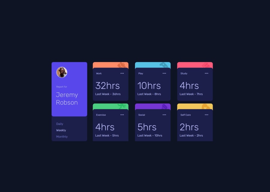
I like the hover-over for the cards. I don't have FEM Pro so I had no Figma. My best-guess was to just make the header line with the ... look like it may go somewhere if clicked. Your choice was great too!
Only two areas I see you might want to improve: -- the 'Daily' selector does not have an active state like 'weekly' and 'monthly' have. -- I like the responsive break-points. To my eye, maybe the middle break point layout could use some work. To me, I don't think the Name-plate card should fall in line with the Activity cards until the smallest break-point. My 2c. Yours works fine though, and again, I don't know if the design asked for something I didn't have access to.
Happy coding! --Lincoln
0

Please log in to post a comment
Log in with GitHubJoin our Discord community
Join thousands of Frontend Mentor community members taking the challenges, sharing resources, helping each other, and chatting about all things front-end!
Join our Discord