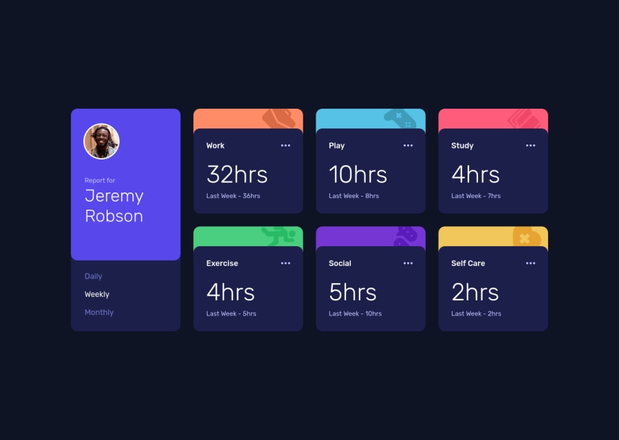
Design comparison
Solution retrospective
I would like to receive any feedback, specially in the js part
Community feedback
- @elaineleungPosted over 2 years ago
Hi Rodrigo, I really like your solution here, especially the counting digits. Your code looks clean and well written, very readable. The only comment I have is, the "Last Week" label should probably be changed according to which time frame is selected, e.g., "Yesterday for "daily", "Last Month" for "monthly", since the "previous" and "current" numbers most likely refer to the same time frame. I also did the same thing you did until I was checking out the other solutions, so I thought to highlight that point for others as well. Good job once again!
Marked as helpful0@s0alkenPosted over 2 years ago@elaineleung Hey! I totally missed that! I updated my solution, thanks for your feedback!
1
Please log in to post a comment
Log in with GitHubJoin our Discord community
Join thousands of Frontend Mentor community members taking the challenges, sharing resources, helping each other, and chatting about all things front-end!
Join our Discord