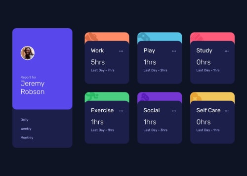
Submitted over 1 year agoA solution to the Time tracking dashboard challenge
Time Tracking Dashboard
sass/scss, accessibility
@fatemzh

Solution retrospective
What are you most proud of, and what would you do differently next time?
I'm most proud of effectively using CSS Grid to build a responsive layout. Also, I realised that I build responsiveness faster by getting more accustomed to the mobile-first approach.
What challenges did you encounter, and how did you overcome them?I encountered a lot of trials and errors with the JavaScript part, especially when working with dynamic data. I overcame these challenges by methodically debugging and refining my approach with each iteration.
What specific areas of your project would you like help with?No specific ones at the moment but I always welcome constructive feedback.
Code
Loading...
Please log in to post a comment
Log in with GitHubCommunity feedback
No feedback yet. Be the first to give feedback on Fatima Abid's solution.
Join our Discord community
Join thousands of Frontend Mentor community members taking the challenges, sharing resources, helping each other, and chatting about all things front-end!
Join our Discord