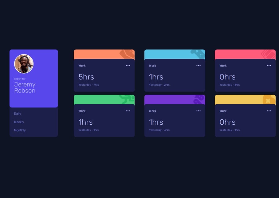
Design comparison
SolutionDesign
Solution retrospective
What are you most proud of, and what would you do differently next time?
I am proud of the styles that matched closely with the wireframe. I would use less and more neater code for styling.
What challenges did you encounter, and how did you overcome them?Since using React for long time I had forgotten to manipulate the DOM with pure JavaScript and was stuck for a few minutes. I had to research the basics again on manipulating the DOM with vanilla JS and came with a solution. I then looked at others solution to see how they approached the problem and found more suitable, cleaner solutions. Gaining extensive tips and knowledge from others has helped me and reminded of vanilla JS DOM manipulation.
Community feedback
Please log in to post a comment
Log in with GitHubJoin our Discord community
Join thousands of Frontend Mentor community members taking the challenges, sharing resources, helping each other, and chatting about all things front-end!
Join our Discord
